The rapid development of urban areas across the country is leading to the reappraisal of the commonly found, and often maligned, parking garage. Boston-based architectural practice French 2D has joined this trend by invigorating a drab parking garage using a mesh facade with dynamic graphics intended to serve as a large-scale artistic canvas as well as a functional enclosure.
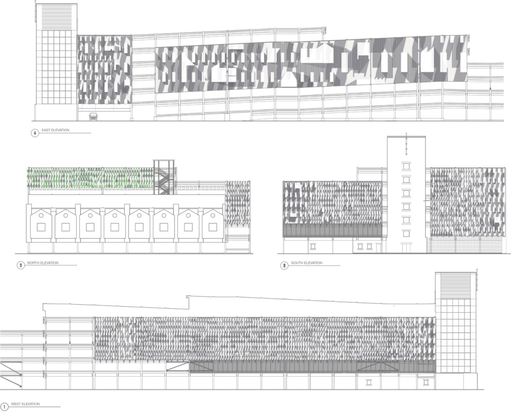
The design of the parking garage’s facade was intended to reference the competing architectural scales and functions of the surrounding Kendall Square. The neighborhood, separated from downtown Boston by the Charles River, is defined by newly built tech hubs, residential buildings, and a fading industrial heritage. For the design team, the primary challenge and objective of the project were to break up the monolithic scale of the existing garage—it is eight stories and measures a whopping 350,000 square feet.
“To address this we played with the perception of large scale figures and patterns at drastically different distances, as well as the fidelity of printing to desired visual contrast,” said French 2D principals Jenny and Anda French. “Full-scale mock-up panels were hung on site for review by the design team and city officials, allowing for adjustment of the graphics files to ensure that the image was high contrast enough to compete with three-dimensional building facades.”
How does the artwork conform to these different scales? The graphics are effectively divided into three separate categories; skyline, street, and reveal views. The pattern across the garage’s 25,000-square-foot facade canvas is relatively constant and defined by rectangular and triangular forms that are linked by diagonal strands of shade, evoking the shadows cast across facades with material depth. From the farthest vantage points, defined as southwest Binney Street and Fulkerson, the graphics are oversized, and, in a certain sense resemble the boxy massing of post-war structures. Shifting to the street reveals views of the enclosure as the gain of the pattern increases in density, leading to a subsequent freneticism in the shading.
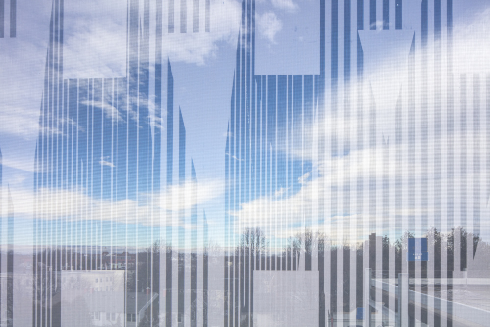
In daylight, the exterior of the garage remains opaque, while the significant density of perforations allows for outward views and natural, passive ventilation—the garage itself is not outfitted with any form of mechanical ventilation. Owing to the hidden aluminum tension frame produced by Facid North America, the mesh enclosure remain remarkably taut with minimal gaps between individual panels. The result is a semi-continuous surface covered with significant openings that reveal the concrete-and-steel structure below.
For the project’s official photography, the French sisters acted as drawing scale figures with custom dresses fitted with a rendition of the building’s facade pattern—in effect forming a fourth category to the graphic design’s scales.