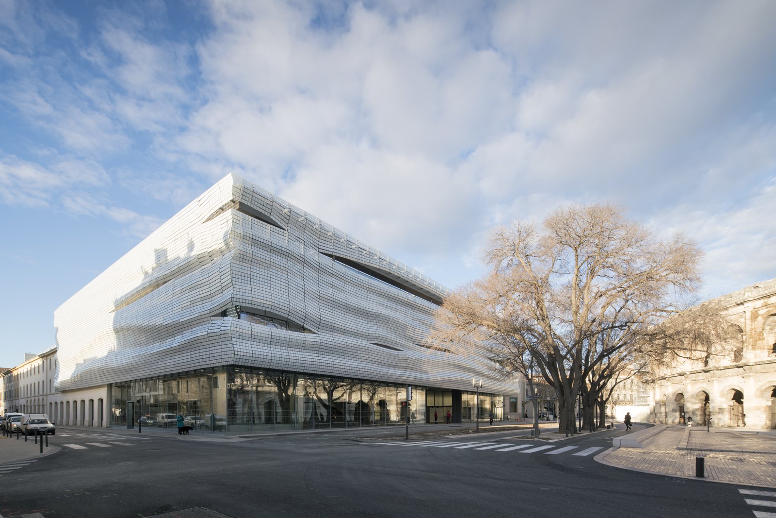
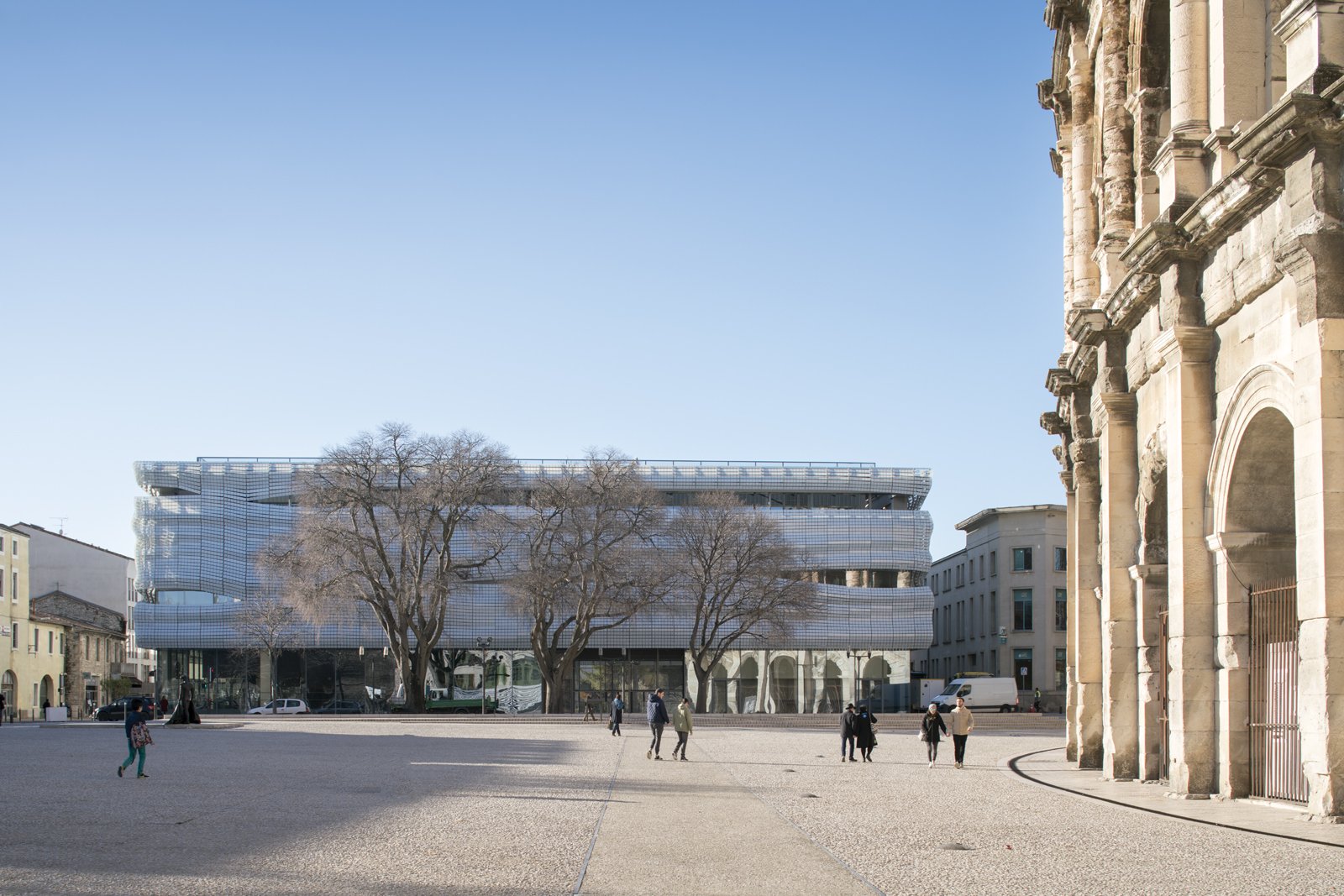
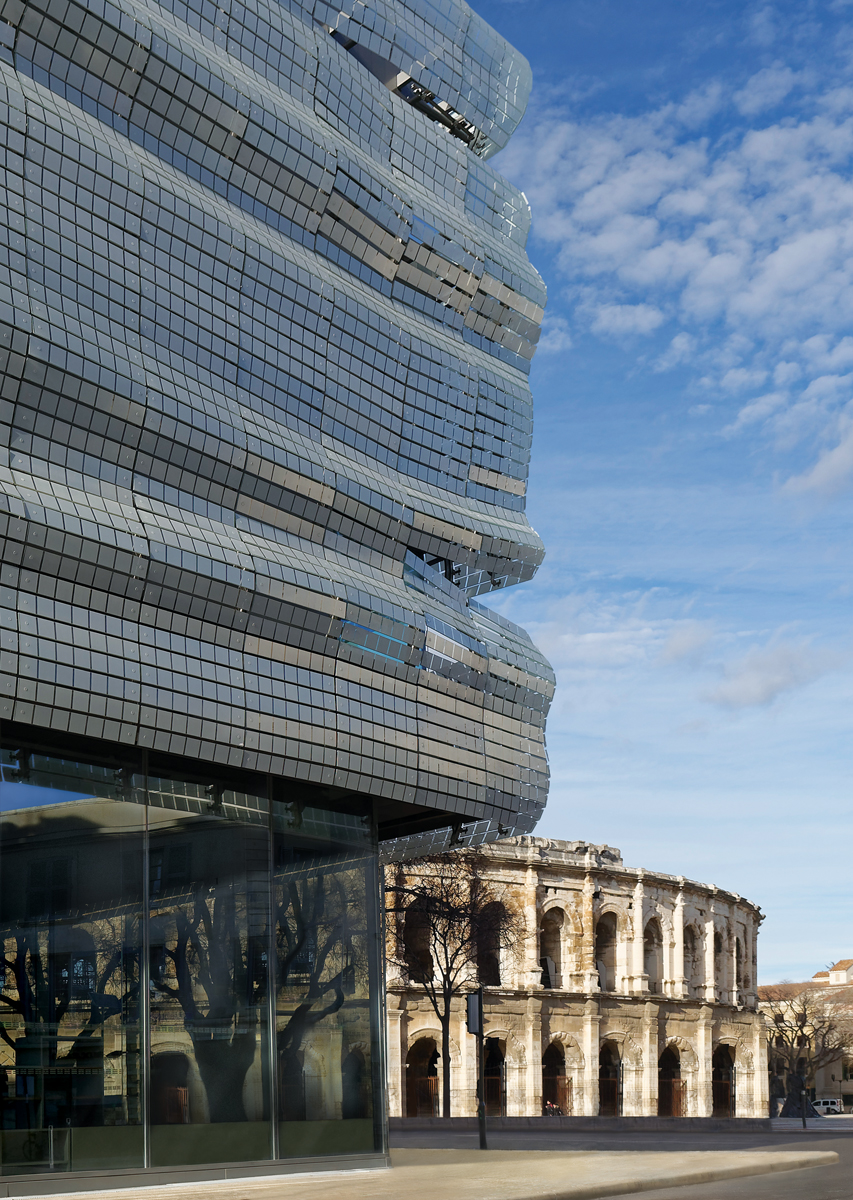
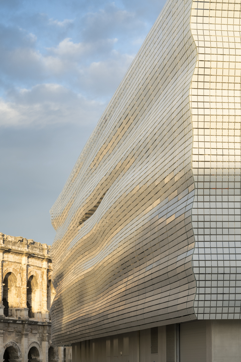
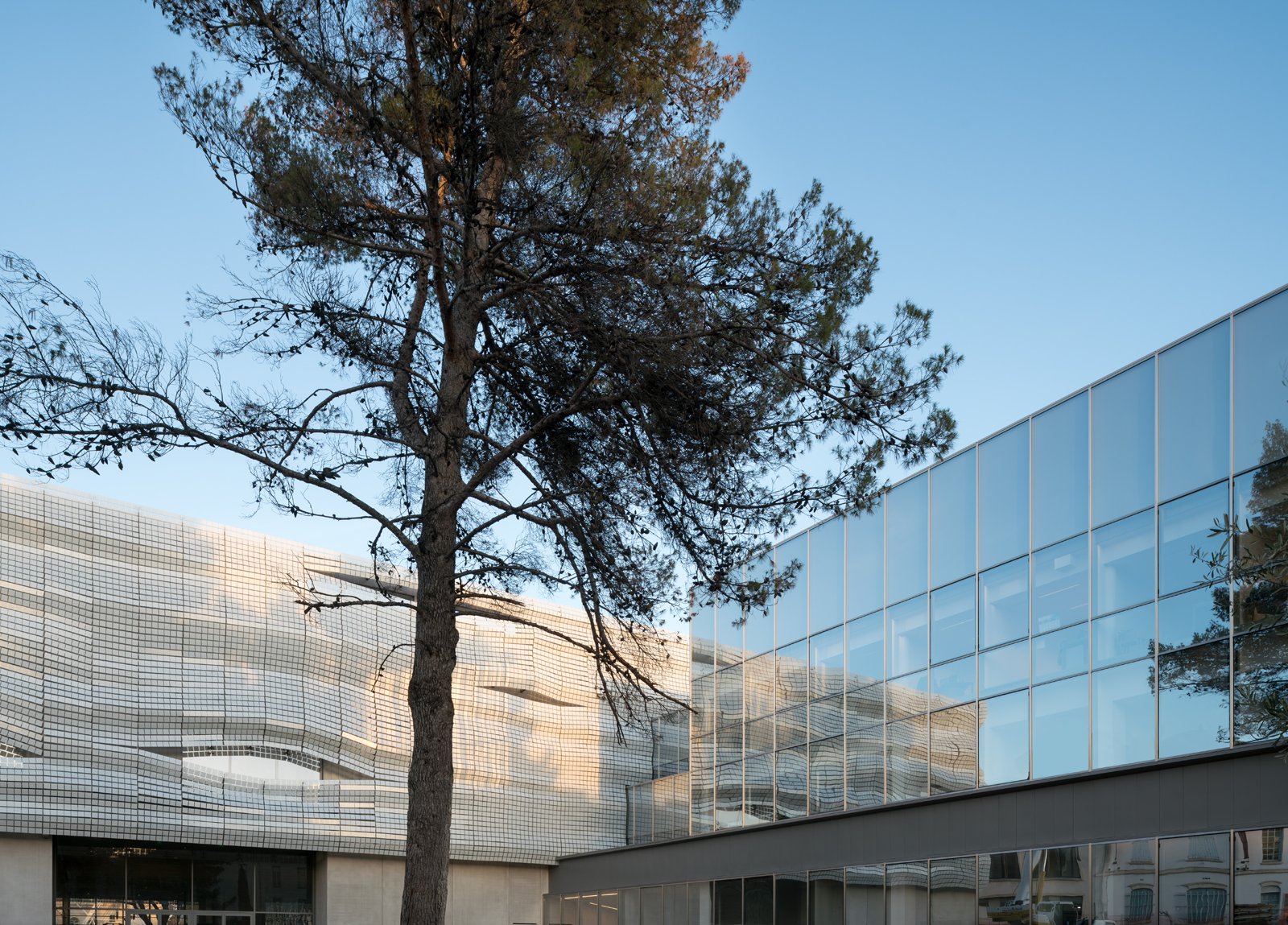
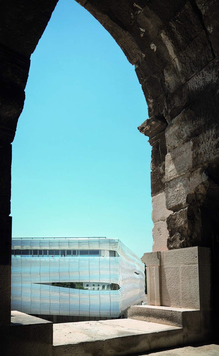
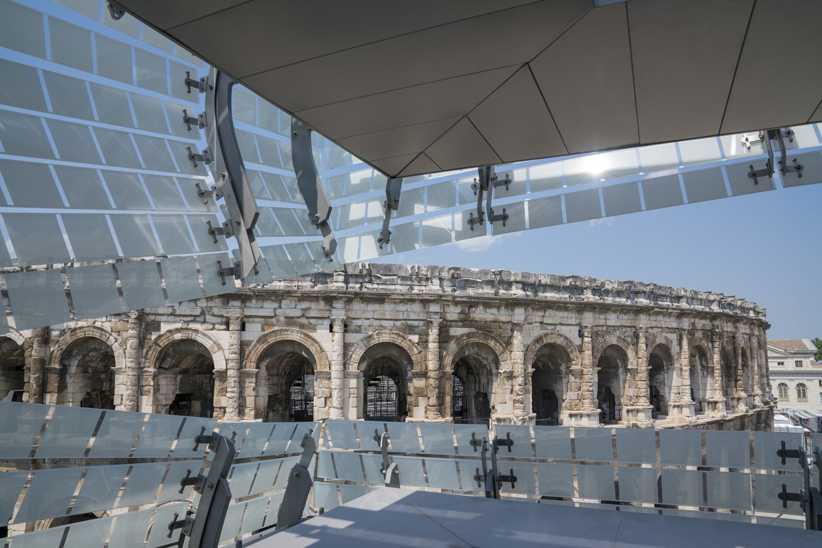
With an extensive archaeological collection spanning from the 7th century BC through the Middle Ages, the Musée de la Romanité, located in Nîmes, France (opening summer 2018), presents artifacts from the “romanization” of local society both before and after the city’s Roman occupation. The project, which has evolved into one of the largest contemporary architectural projects in France, is the result of an international competition dating back to 2011. Designed by Paris-based Elizabeth de Portzamparc, the resulting museum establishes a dialogue with an adjacent 2000-year-old amphitheater through a veil-like glass tile screen.

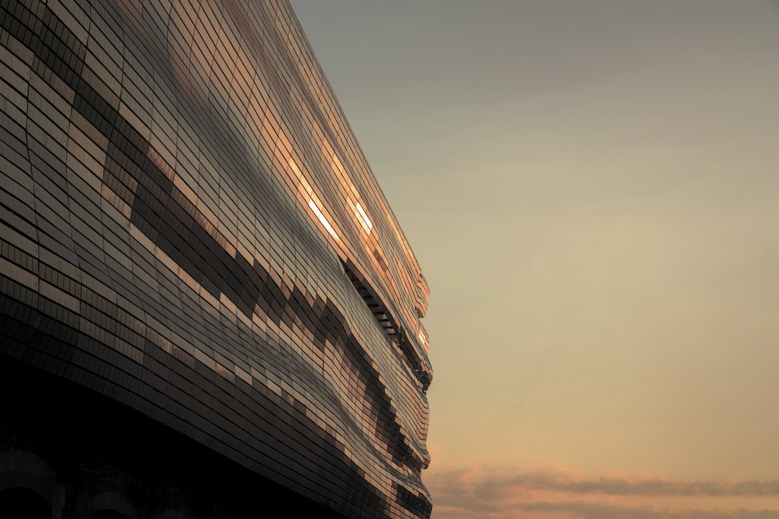
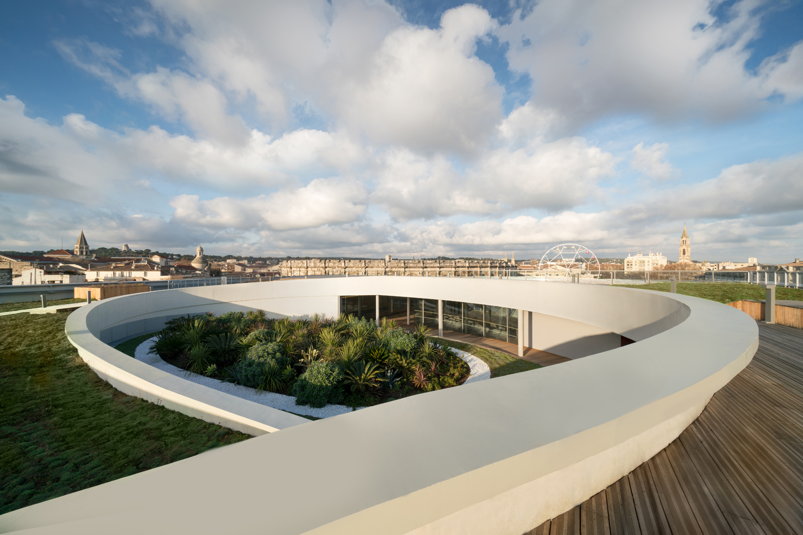
The building aims to produce this dialogue by being different instead of similar. Seen from above, the museum is organized in a square plan that contrasts with the amphitheater’s curvilinear form. The materiality of the adjacent Roman stone structure and what Elizabeth de Portzamparc’s office calls the “magnificence of vertical arches passed down to us through the centuries,” is answered with a decidedly light assembly of digitally-crafted steel and glass. The result is an undulating, textile-like drapery that seemingly floats over the archaeological context.
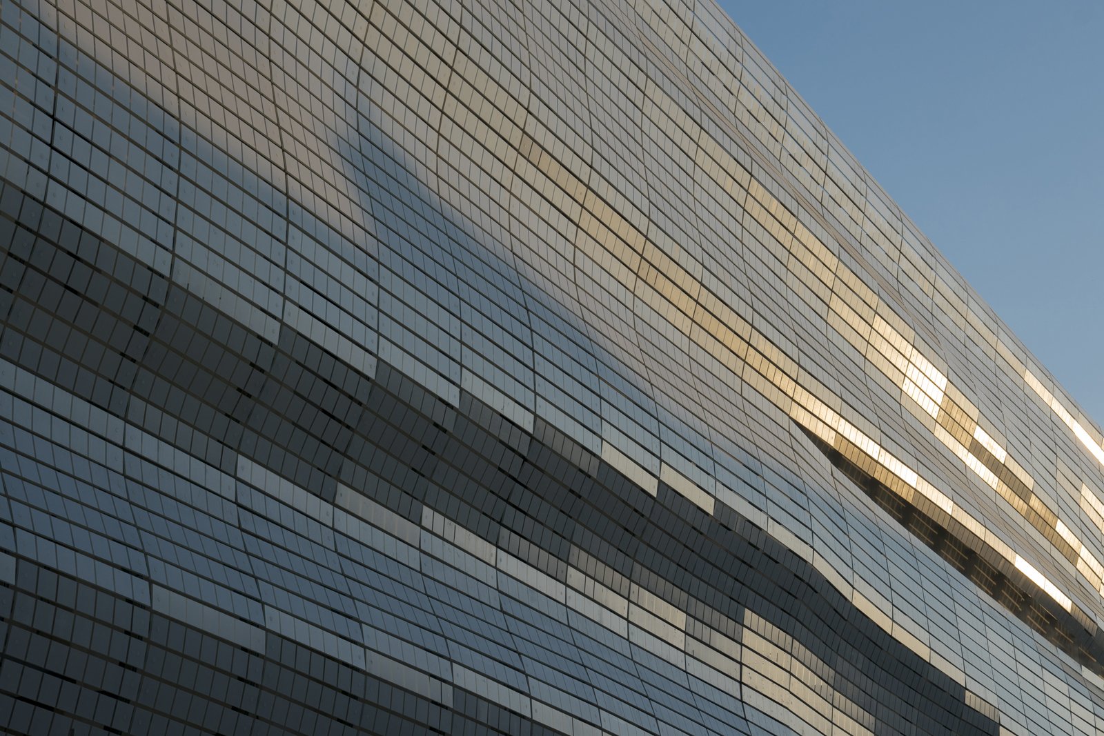
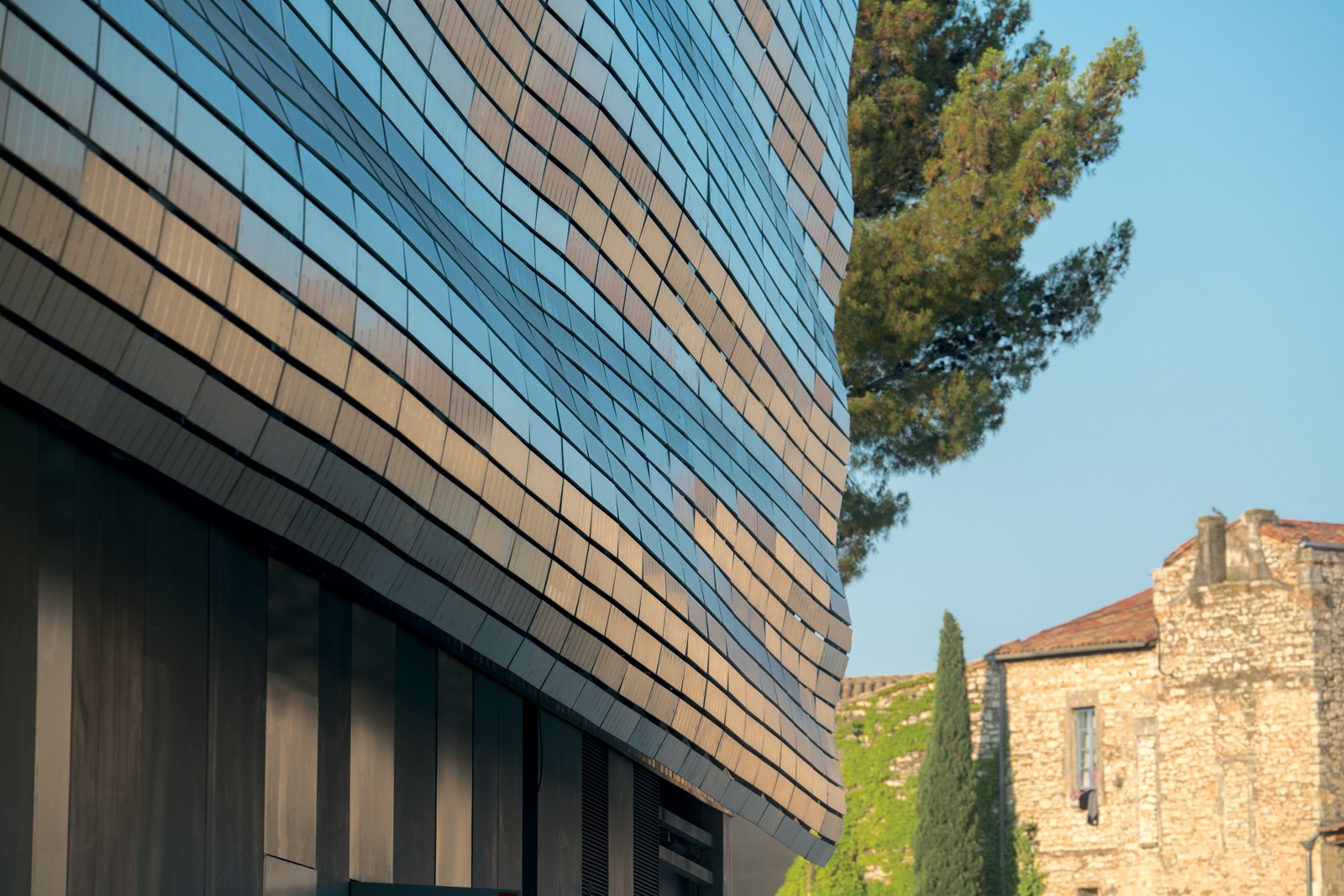
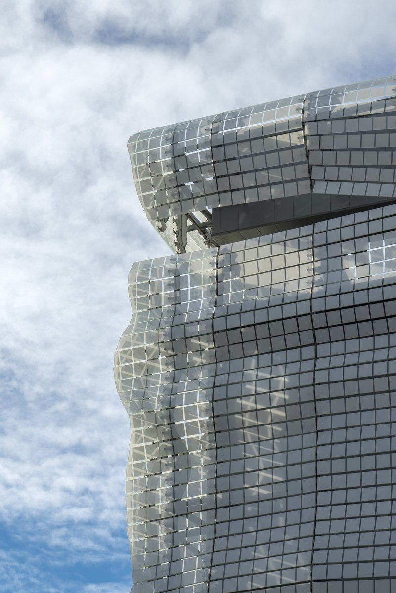
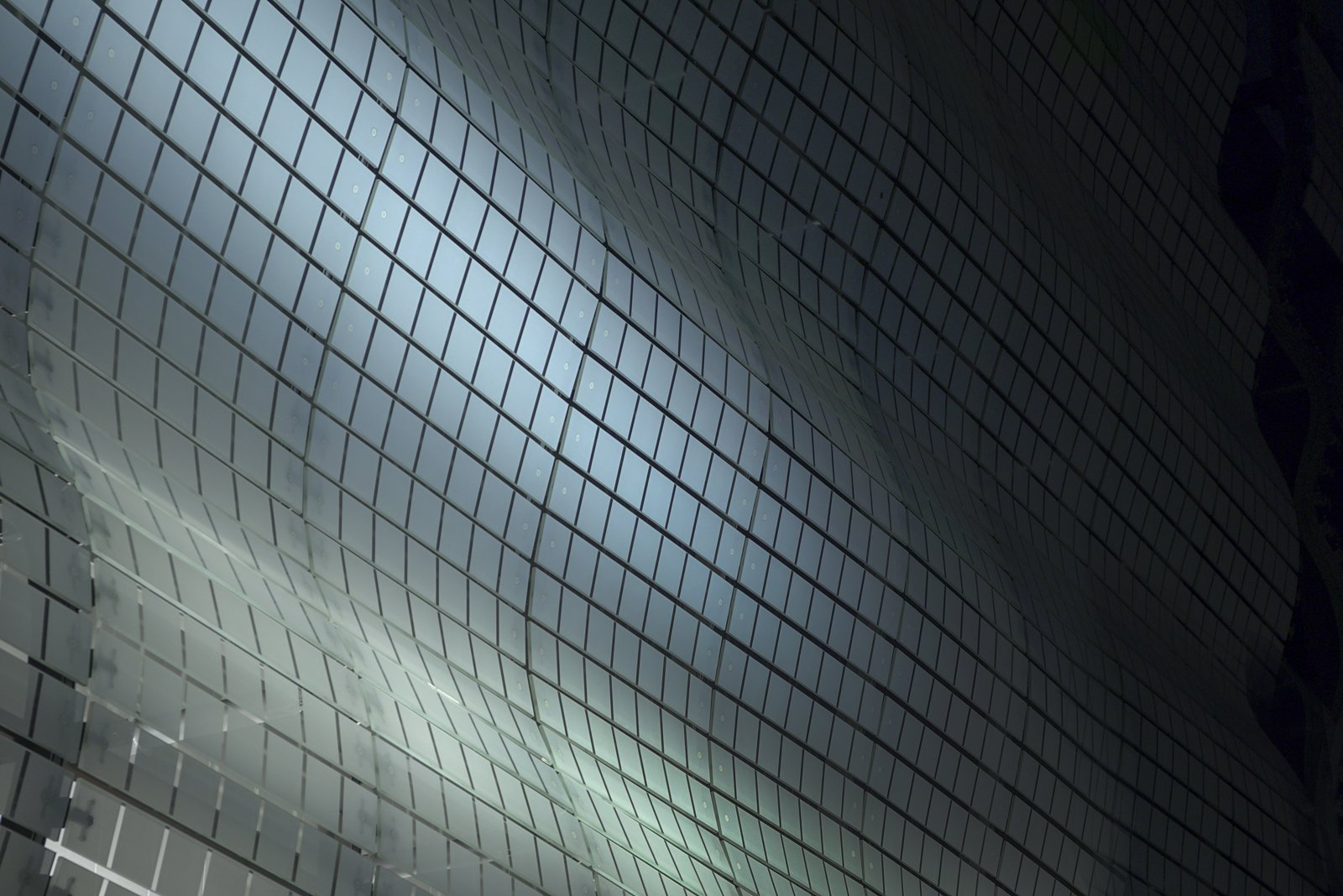
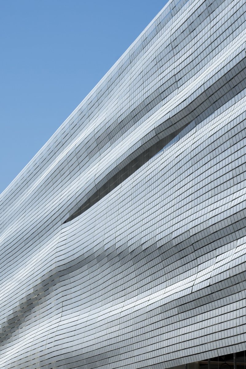
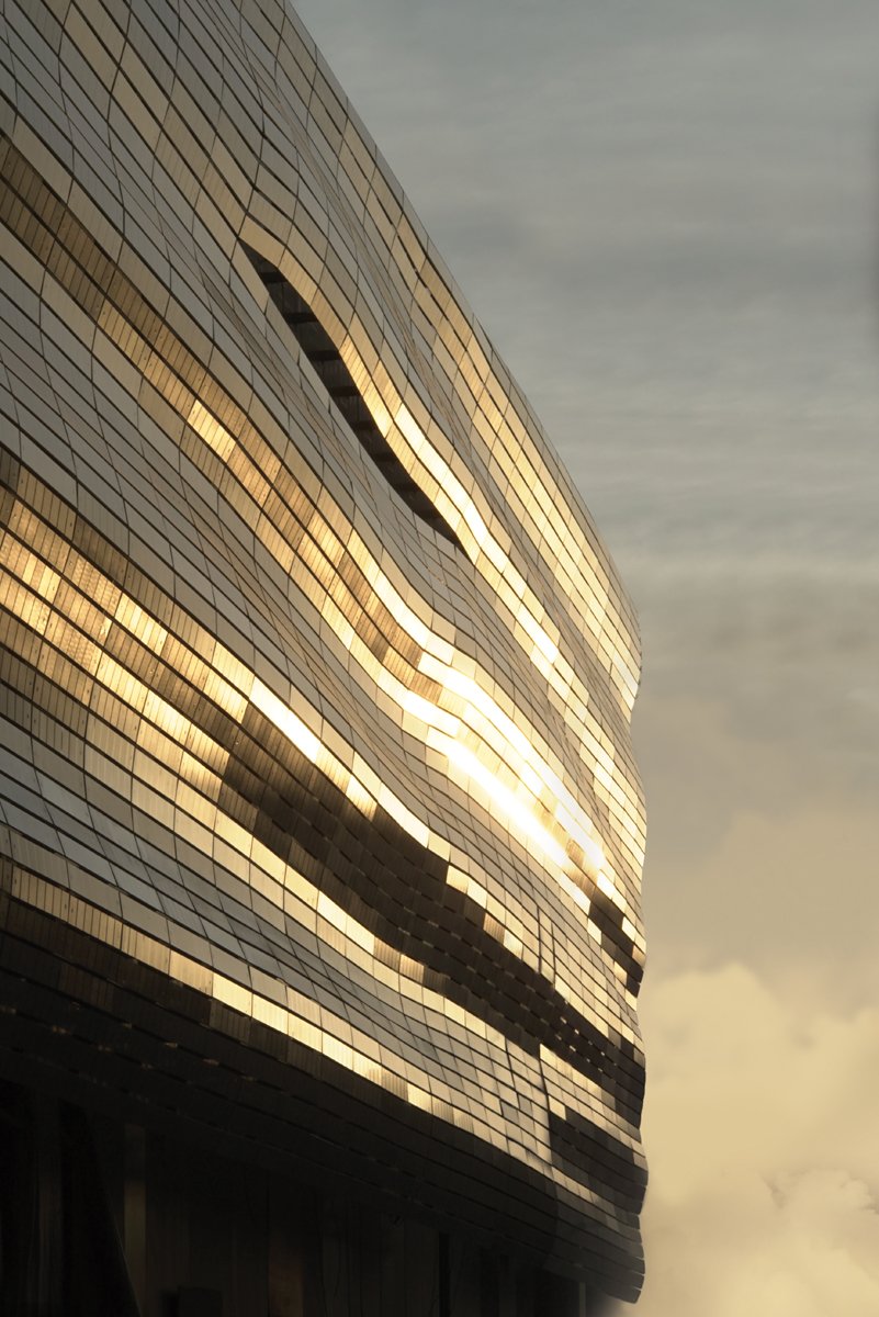
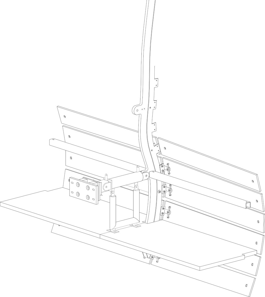
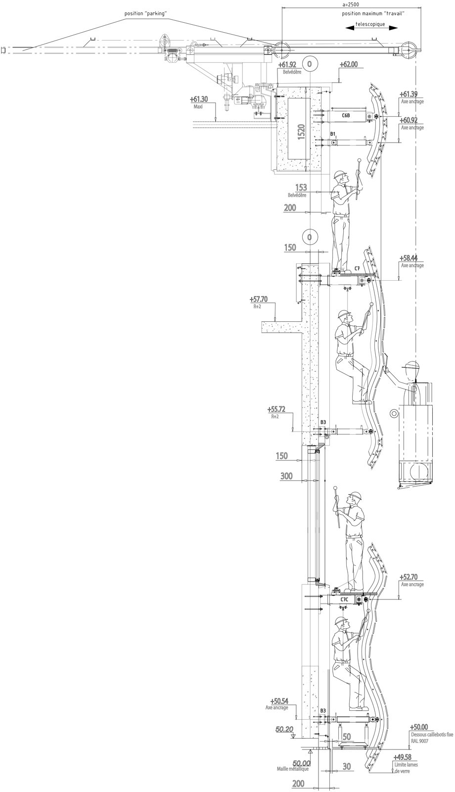
The Musée de la Romanité’s facade is composed of over 7,000 structural glass units measuring approximately 5-feet-long by 8-inches-tall by less than three-eighths-of-an-inch thick. The glass “strips” were screen printed with 8-inch opaque white squares on their exterior face to maximize legibility and solar shading performance. Each strip was installed individually on site over a delicate framework composed of primary vertical members and secondary horizontal girts. This framework establishes specific undulations based on the curvature of the facade. The mechanical attachments were specially coated to blend in with adjacent finishes to produce an additional level of seamlessness.

The lightness of the system is all the more impressive given the site’s location within a seismic zone that extends through parts of southern France. The unique assembly of glass strips, as opposed to a custom molded glass system or more traditional curtain wall, arose from a desire to achieve a visually thin structure and required the design team to manage the weight of the glass assembly.
“We finally chose the strip system so as to obtain a background structure as light and less visible as possible, allowing an important economy of raw materials and construction costs in comparison to a molded glass facade, which requires very expensive and heavy bearing structures,” said de Portzamparc. “The result is very lively for its subtlety and its reflections that extend the colors of the surrounding buildings and the sky that changes every hour of the day.”
The architects developed the project through a 1:100 scale study model that was based on two parametric aspects: geometry and graphic design. Several tests at full scale also occurred in parallel to the model to study the detailing of key attachment points. The team worked through iterations of translating a fluid digital surface into a contoured assembly of horizontal strips, working to manage gaps between the strips so as to achieve a continuity of the surface through smaller building modules.
