With 71 facades articles published in 2021, it’s time to take a look at a few of AN ’s most popular and some whose projects feature unique materials and construction methods. Ranging from large dormitory projects by well-known firms to a projects that utilize local cork, thatch, and brick, the following list covers the full range of facades that debuted in 2021.
Amant Foundation
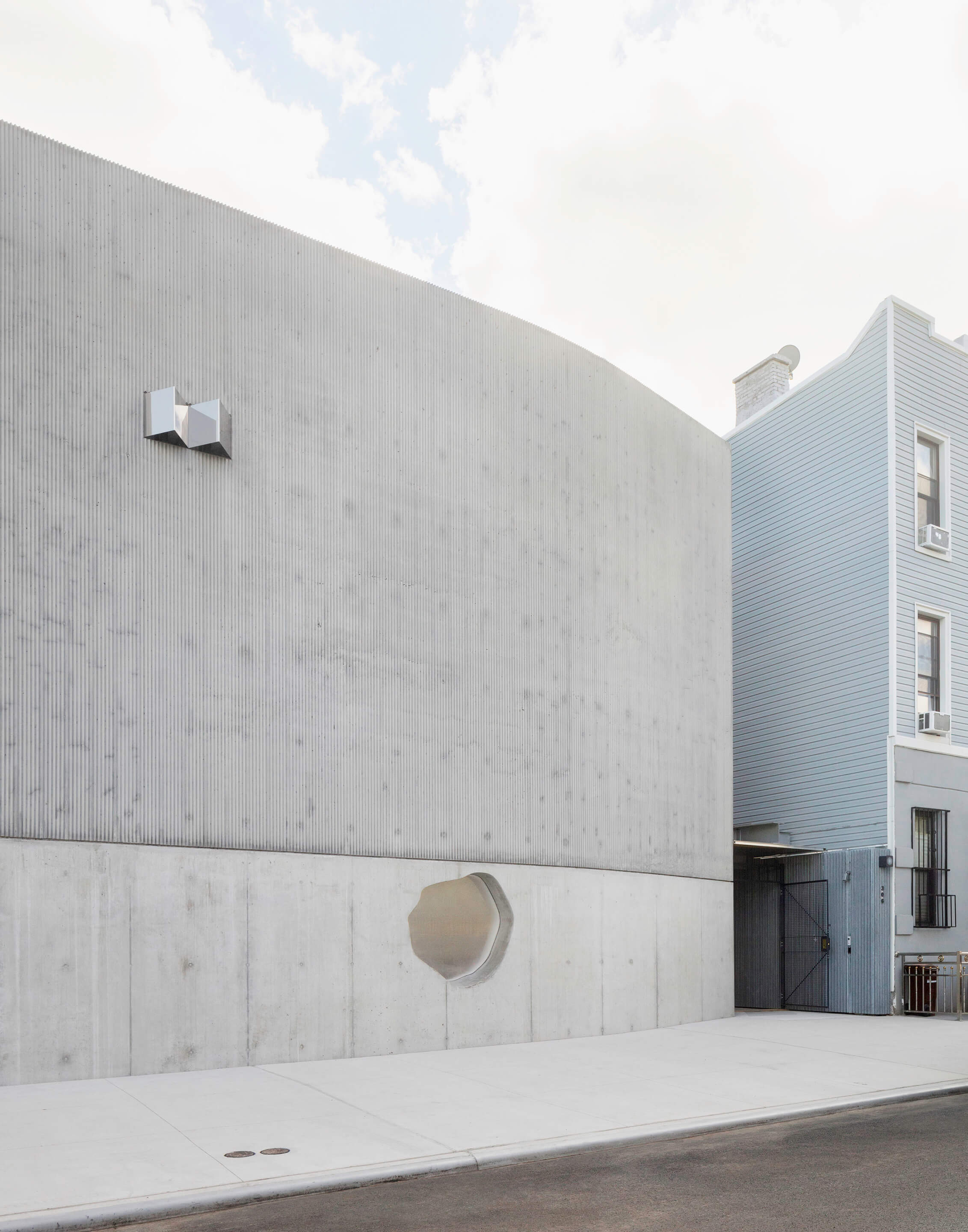
Clay and brick form the facade of the Amant Foundation, actually a collection of four buildings, and defines one of Brooklyn’s more recent cultural institutions. The main entrance at 315 Maujer was formed by 7-by-3 inch cement bricks and metal louvers, with the brings angled into a dogtooth pattern. Textural complexity was achieved by individual bricks having smooth and rough sides on the north-facing courtyard, while the east-facing courtyard uses exclusively rough materials. Working with Silman, the metal louvers—fabricated by 618 design—were attached to a hidden mounting system away from building corners, allowing the brick to define the facade without structural elements obviously showing.
At 932 Grand, clay bricks were textured by their extrusion from standard brick manufacturing. The extrusion machine left grooves in the surface of the brick, hiding the bond mortar that would otherwise have been accentuated. Smoother faces of bricks were used on the inward-facing sides of the building, blurring interior/exterior boundaries as brick continues to show in interior elements of the building. The final two buildings, on Maujer Street, were defined by a singular window against an otherwise blank facade that feels more Brutalist than a product of a clever use of brickwork. Ultimately, Amant’s collective facades are marked by their clean, tonal palette that is able to mask structural elements of the buildings.
Infinitus
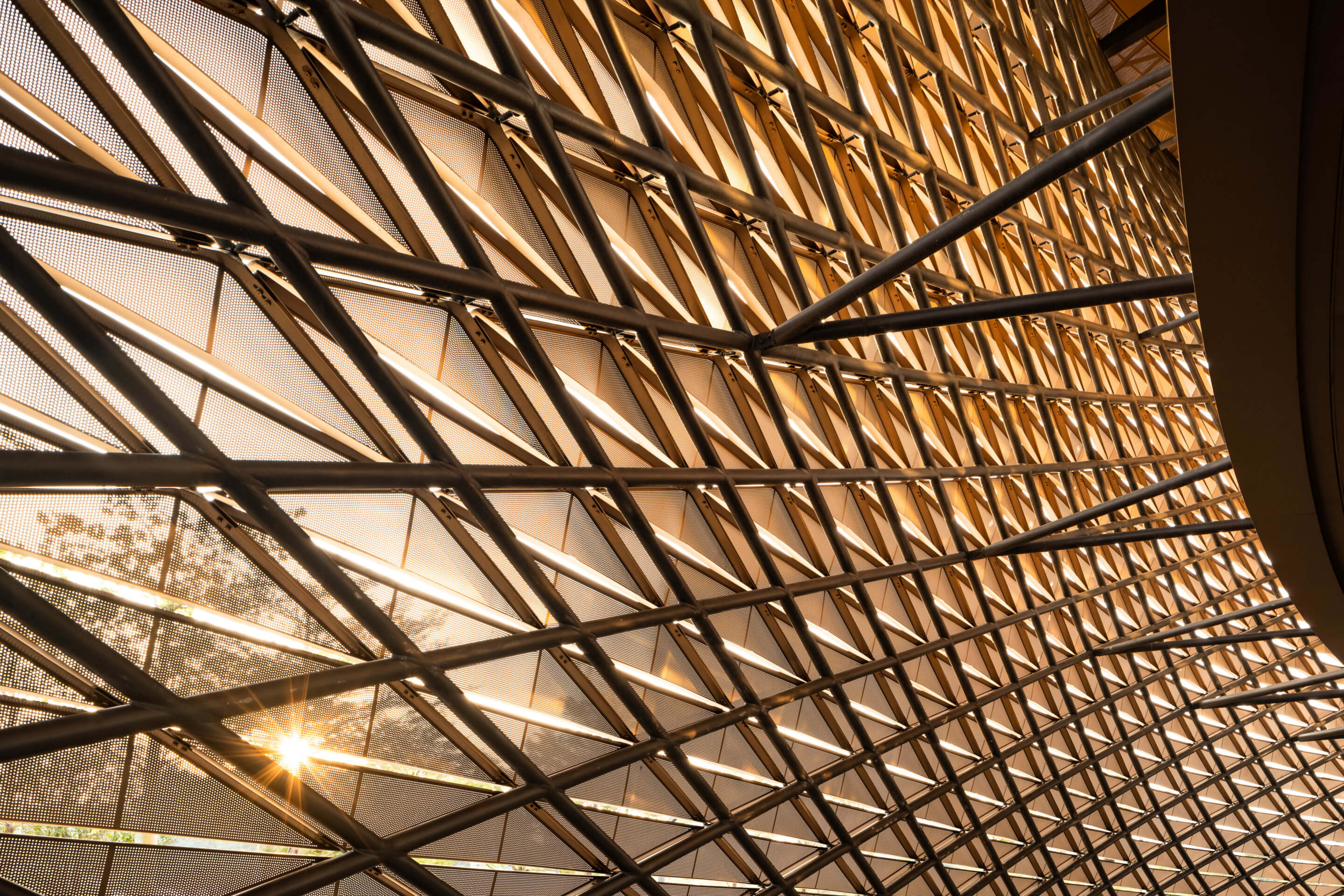
Emphasizing visual continuity and fluidity, Zaha Hadid Architects’ Infinitus Plaza in Guangzhou, China, serves as a new home for herbal health products manufacturer Infinitus China. The building—shaped like an infinity symbol—connects two identical towers through two sets of corridors over the former Baiyun Airport. The facade, with contributions by facade engineers at Buro Happold, was made of perforated, double silver Low-E IGU aluminum panels, shaped like diamonds to cut construction costs by 30 percent compared to more standard curved panels. The diamond pattern also gave the facade a unique textural character, and the perforations were cut to maximize reductions in solar heat gain. Additional considerations were given to allow natural light to enter the building and to prevent noise from the wind while providing transparency through the panels from the interior. The copper hue of the panels made for a highly reflective facade, and when combined with the diamond pattern, Infinitus Plaza’s facade will serve as a new face of the company in the city’s Baiyun Business District.
MIT Site 4
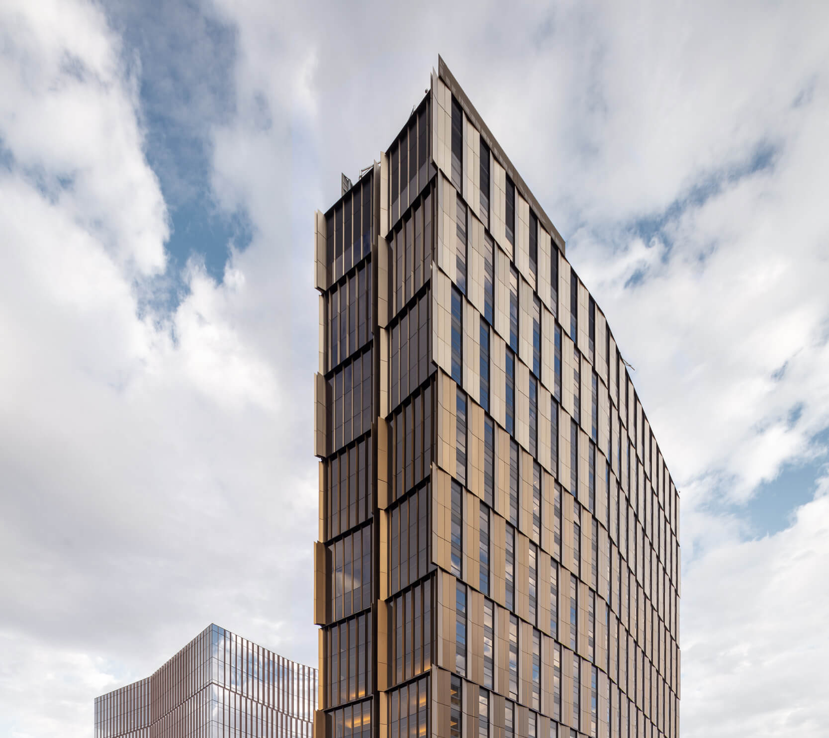
Wanting to build a seemingly inconspicuous tower on Main Street in Cambridge, Massachusetts, NADAAA used glass and anodized aluminum unitized panels for a new 29-story MIT residential tower, known as MIT Site 4. Coming in at 10-feet-tall, and between 15 and 29 feet wide, the aluminum panels weigh over 4,200 pounds apiece, but seem giant due to gradations in their color and concave depressions. The initial design included 3-story-tall panels, but after receiving opinions from fabricator Island Exterior Fabricators and facade consultants Studio NYL, horizontally-oriented panels were opted for as they would be easier to transport and install.
On the fifth story, a system of concrete and steel trusses cantilever to support an orthogonal grid of cast-in-place floor plates and columns. The alternating of glass and aluminum achieved its goal of avoiding a monolithic tower rising above Cambridge, while still providing a recognizable new home for MIT students.
Casa Quattro
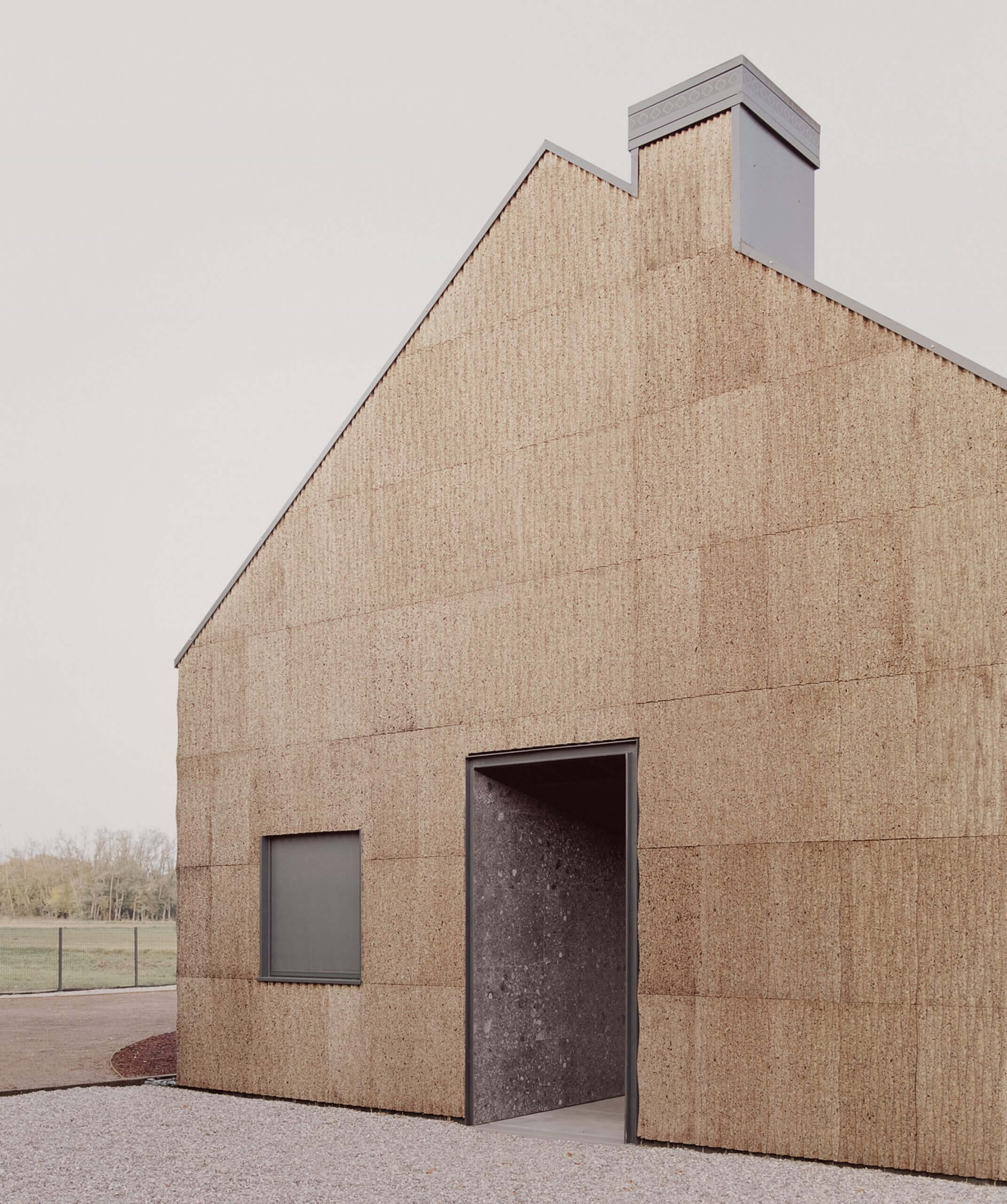
LCA Architetti’s Casa Quattro uses cork, rice straw, and wood to construct a less environmentally impactful house in Magnago, Italy. Using 40-by-20 inch panels made of bark from cork oak, LCA was able to design a simply-constructed facade whose realization, including additional metal panels, only took two weeks. Bales of rice straw from discarded rice plants used by local farmers insulate the house, and the cork provides additional thermal and acoustic benefits. Casa Quattro is self-powered by rooftop solar panels and is passively heated in part by sunlight, forging the increased connection with nature that the clients desired.
Carlisle Cathedral
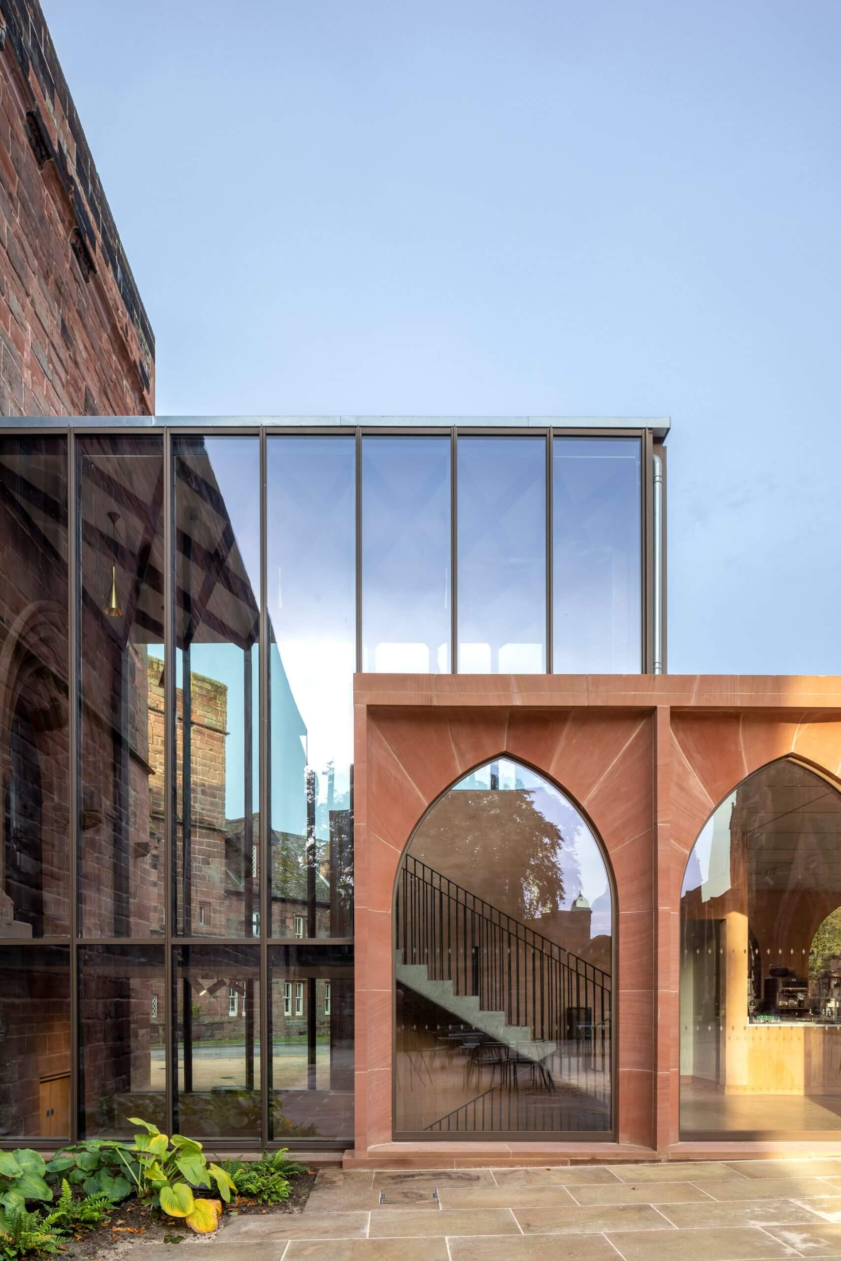
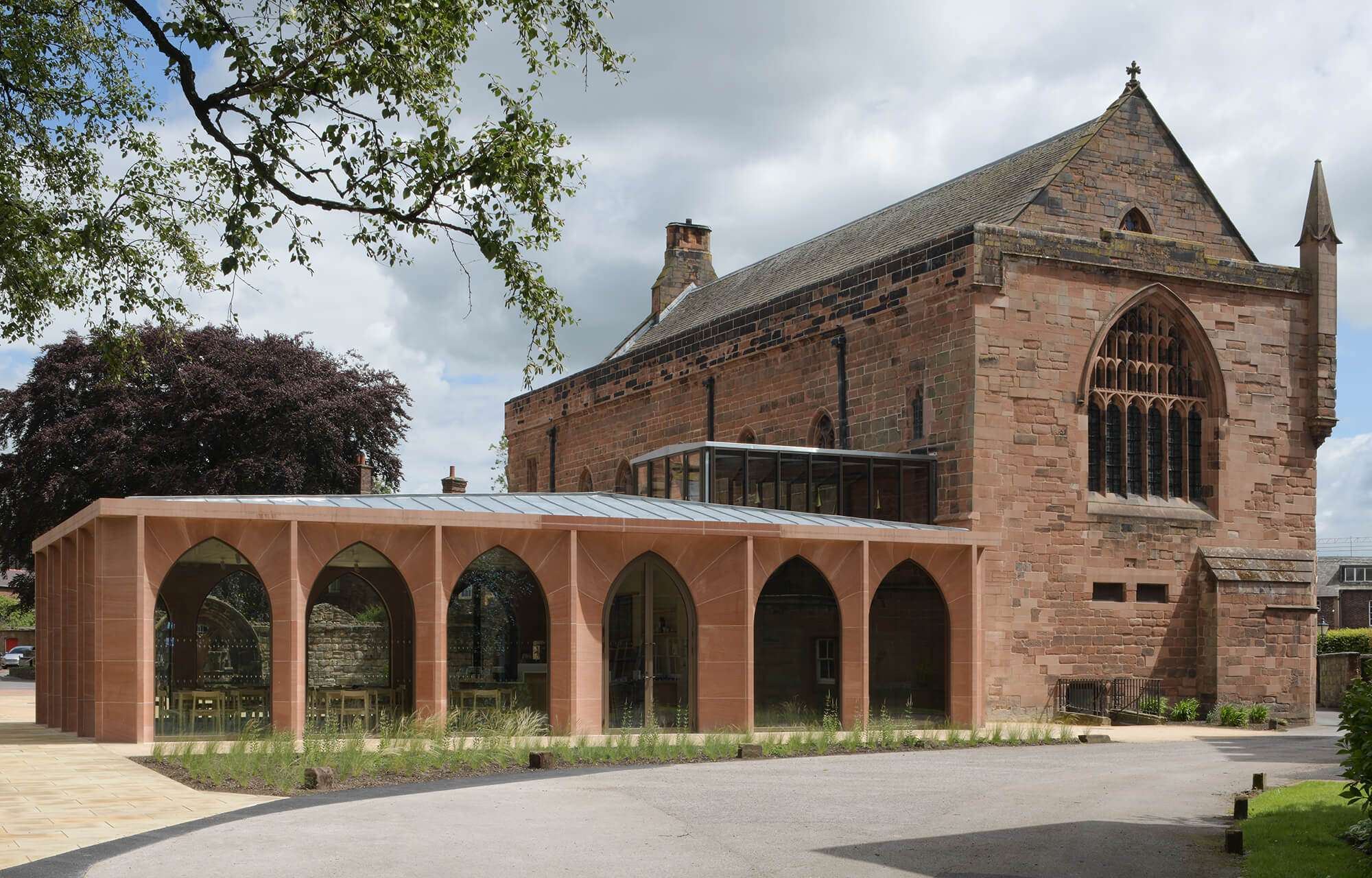
The addition of a pavilion to the Carlisle Cathedral, built in 1522, draws from the building’s existing gothic style while fixing a gap left by stones taken to bolster the Carlisle Castle in the English Civil War. Designed by Feilden Fowles, the pavilion’s facade is defined by pointed arches reflective of the cathedral’s original architectural style. A bronze-glazed glass corridor connected the existing cathedral to the new pavilion, and significant caution had to be taken in the overall construction given the cathedral’s Grade I listing.
Using both CNC and hand cutting techniques from local stonemasons, 19.5 inch-deep Locharbriggs sandstone formed the facade of the pavilion in a similar red hue to the brick of the existing cathedral. The stonework was digitally modeled before installation, with the arches ultimately being able to support themselves with only the help of stainless steel brackets connecting them to the steel structural frame.
One Hundred
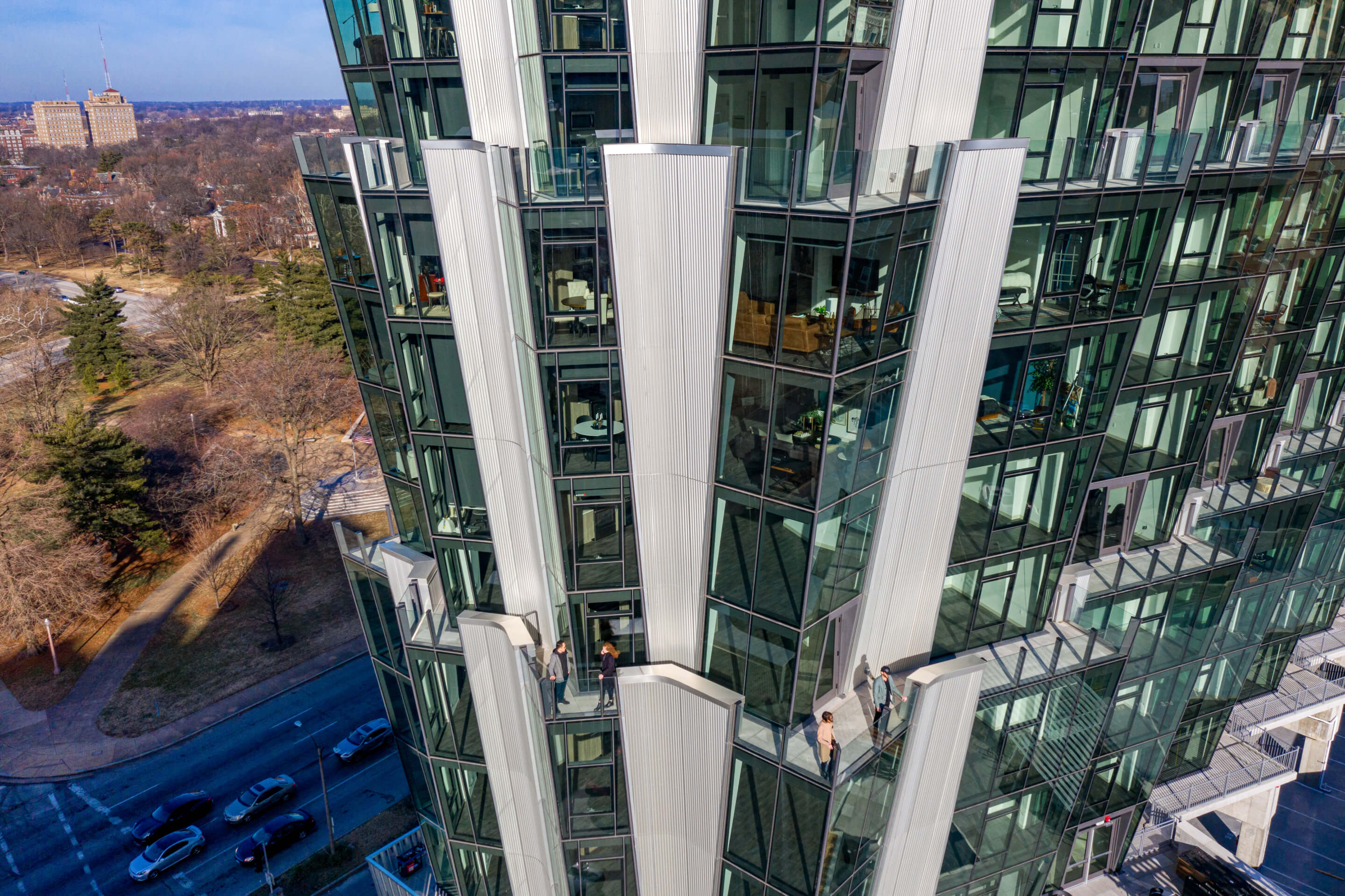
Studio Gang’s One Hundred juts out from St. Louis’ Central West End like an inverted geode, with a glass-and-anodized-aluminum facade evoking art deco elements for the city’s new residential tower. Although the facade was not the original focus of the building’s design it is hard to miss, especially against the park and monolithic housing towers that surround it. The floor plates were grouped by four- and five-floor sets, expanding horizontally as the building’s height increases, with each set starting with the narrowest width each time the pattern is repeated.
Private balconies were bounded by glass railings and aluminum facade elements, with thermal break designed by consultants Studio NYL to prevent overheating if someone were to grab the railing after it had been exposed to sunlight for an extended period of time. The unitized curtain wall system consisted of argon-filled insulated units with a Low-E coating and operable windows. The anodized aluminum was chosen for its ability to change as it reflects the sky, and is curved at the top of each floor, providing a slight break in the otherwise jagged geometry of the facade.
Eskenazi School
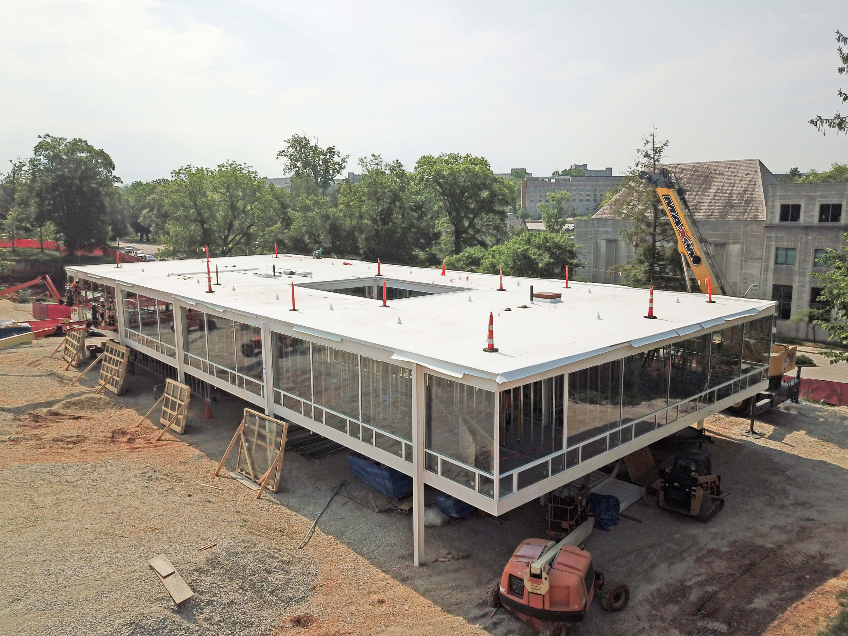
Working from recently discovered drawings, Thomas Phifer and Partners has been able to revive a 1952 Mies van der Rohe project at Indiana University. Originally designed for a fraternity, the building will now be home to the Eskenazi School of Art, Architecture + Design. Wanting to keep as close to the original design as possible, particularly with materials, Phifer and Partners conducted extensive research into other Mies projects. The facade of the school is clearly Modernist, defined by two 60 foot wide by 100 foot long floors set on pilotis with very transparent glass filling the gaps between the painted white structural steel frame. The ground floor will have an enclosed point of entry, while the rest of the structure is set 8 feet above the ground, marking for a ‘floating’ facade.
Extensive planning for the windows and steel has allowed for rapid construction, taking into account tight tolerances with the help of engineers from Skidmore, Owings, and Merrill. To compensate for the poor performance of a lot of glass-heavy Mid-Century Modernist buildings, 1-inch-thick and 10-square-foot insulated glass panels were accommodated by a slightly larger mullion stop size made possible by reduced tolerances on the facade. Additional insulation was added to the spandrel channel at the soffit and roof, making for a slight adaptation of the Mies design for contemporary use.
35 Green Corner
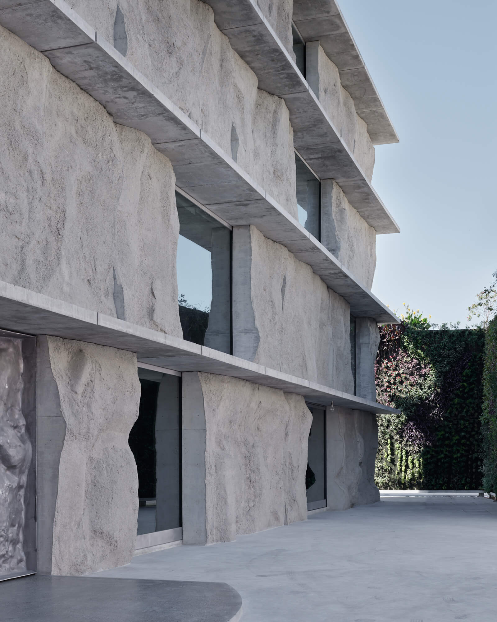
Sand-cast concrete panels define the facade of the 35 Green Corner Building, making use of cost- and energy-efficient construction methods for an art storage studio for the Shaikh Ebrahim Center in Muharraq, Bahrain. Designed by Studio Anne Holtrop, the building stands out for its facade, as the building’s interior program consists of a central core and two identical rooms repeated across four floors. The concrete panels were poured on site, lowering financial and emissions costs while forming a facade that is truly site-specific as each panel reflects the earth around the building. Hollow aluminum detailing, sand-cast offsite, are present in a door that mirrors the panels, aluminum windows, and operable shutters. Large windows reflect the buildings around 35 Green Corner, with the seemingly simple list of materials creating a texturally interesting but seemingly impenetrable facade.
Fass School
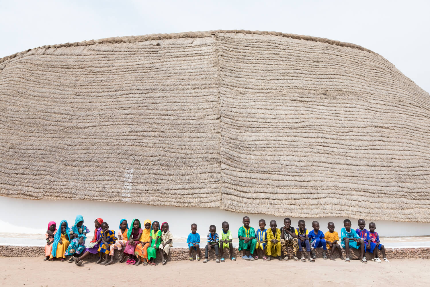
A thatched roof and compressed mud bricks create a cooler classroom in Fass, Senegal, designed by Toshiko Mori Architects (TMA) for the Josef and Anni Albers Foundation and nonprofit Le Korsa. Drawing inspiration from both impluviums—ring-shaped houses traditionally built in the Casamance region of Senegal—and one-room schoolhouses traditionally built in rural Germany where Albers taught, the thatched roof inverts the traditional pitched roof.
Built from locally-sourced reed, hot air is pushed to the roof’s peak while cooler air is forced into the classroom through a stack effect. The roof was pitched at a 45-degree angle, covering the top half of the brick facade and maximizing runoff. The compressed mud bricks that comprised the structure of the facade were painted white to deflect heat, while perforations in the interior were placed to direct ventilation to compensate for the lack of on-site electricity and therefore other cooling options. The construction was completed by a local craftsman, and with TMA providing diagrams for the rest of the building, the community will be able to make any repairs and modifications to the school if needed.
Haikou Cloudscape
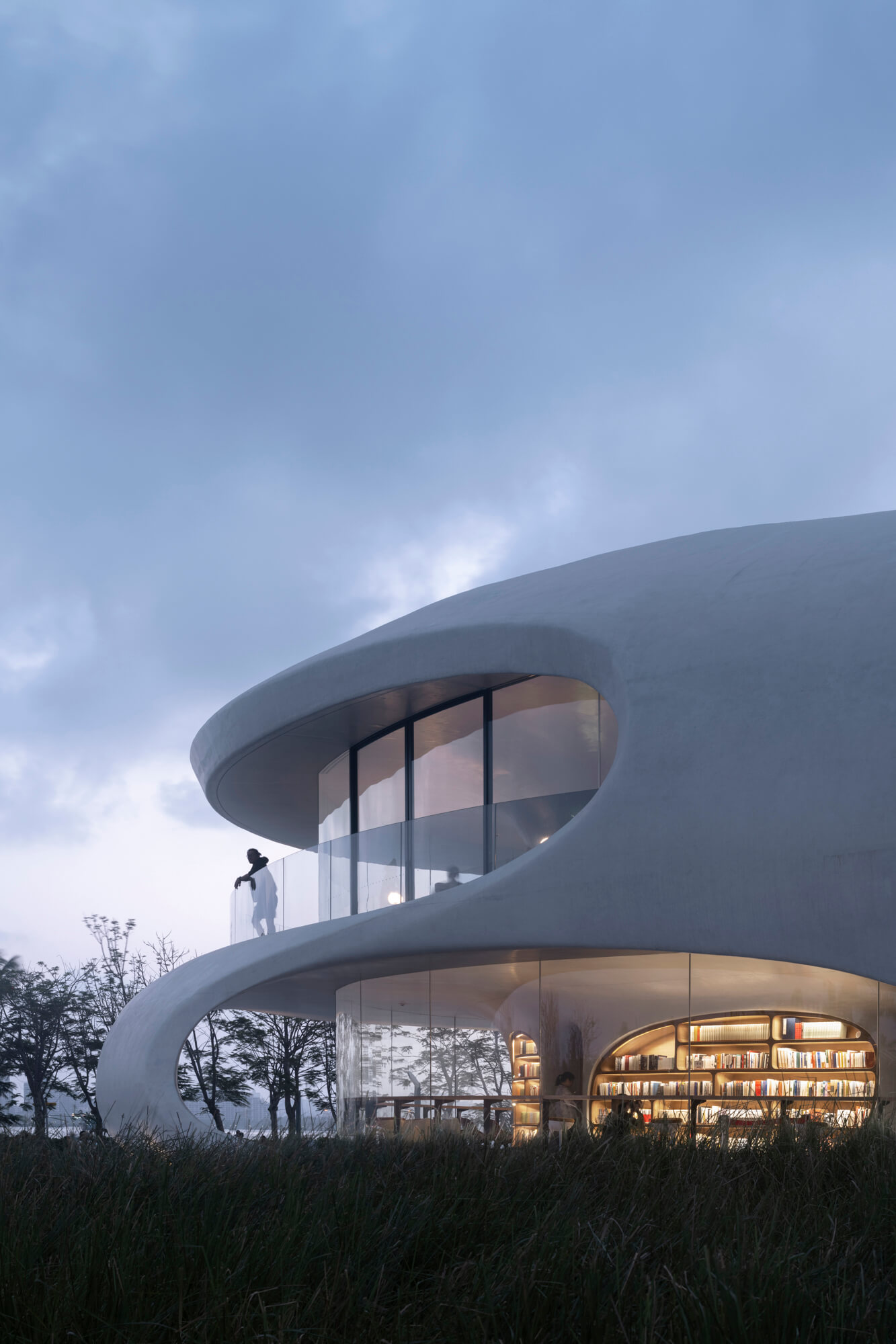
MAD Architects’ organically-formed Cloudscape of Haikou forms a new image for Haikou, China’s historic waterfront. Part of a larger project of 16 pavilions, Cloudscape was designed for a library and waystation for tourists. The facade, and exterior, were cast in fair-faced concrete manufactured by Yihuida Shimizu Concrete. The structure was cast-in-place and was formed with no right angles, typical of MAD’s designs. The roof and floor are formed by seamless slabs, while plumbing, electrical, and mechanical systems are contained within the concrete so as to not interrupt the curvilinear facade.
RFR Shanghai provided facade consulting, and extensive 3D modeling was used by the architectural teams and structural engineer Yang Xiaotian, from the East China Architectural Design & Research Institute. The final forms were CNC-cut to fit glazing elements, and the precision in both modeling and fabrication are evident in a contiguous concrete facade that is only interrupted by windows, allowing visitors a waterfront view.


