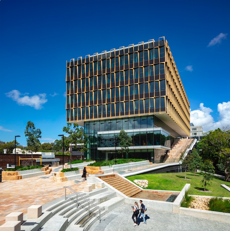
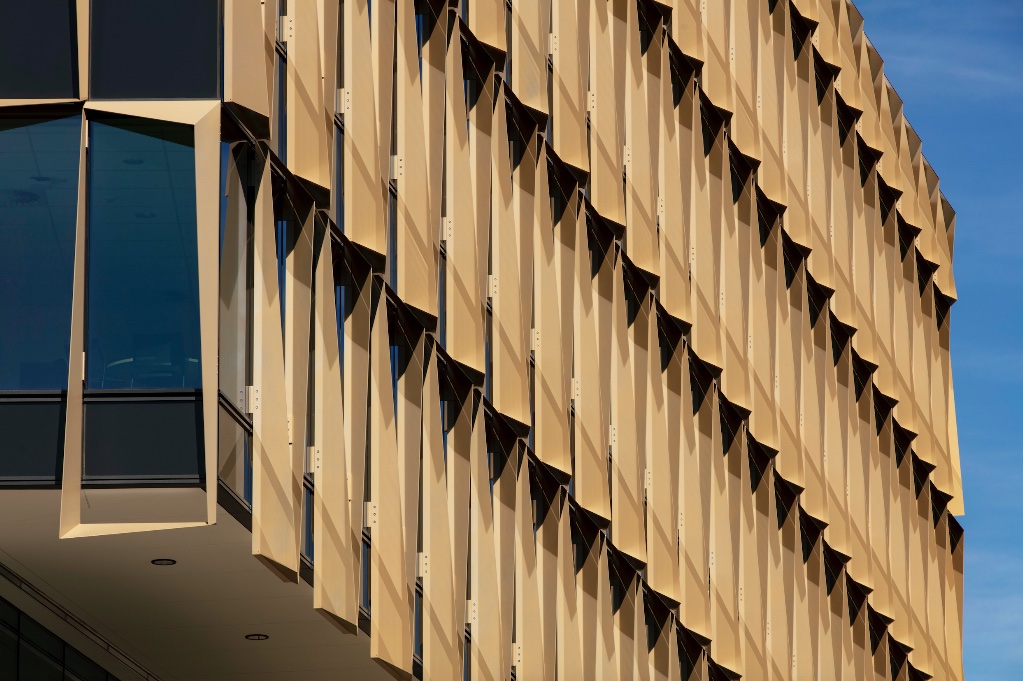
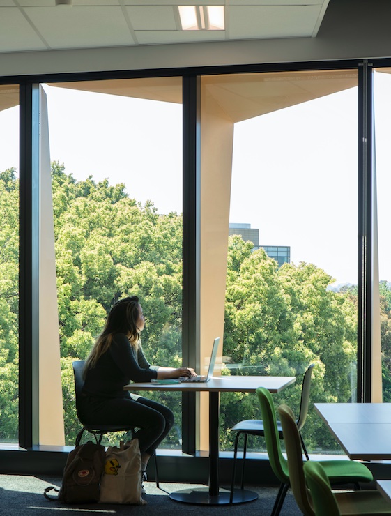
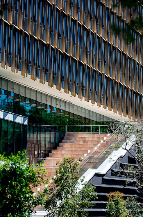
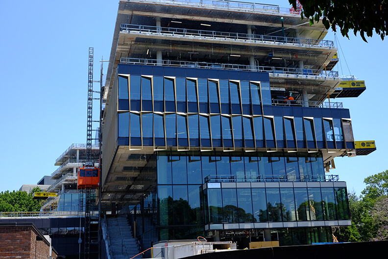
A light-filled, triple-height atrium welcomes patients, students, and visitors to the Susan Wakil Health Building, a new satellite of the University of Sydney. Designed by Diller Scofidio + Renfro and Billard Leece Partnership, the healthcare hub consolidates teaching, research, and clinical functions under one roof. At more than 231,000 square feet, the project footprint is sprawling, and the massing, which responds to local site conditions, complex. But it’s the upper building volume, with its faceted, mustard-yellow facade, that gives the campus its identity.
- Facade
Manufacturer
Upright Systems Australia - Architects
Diller Scofidio + Renfro
Billard Leece Partnership - Structural Engineers
Entuitive - Facade Consultant
Bonacci Group - Construction Manager
Laing O’Rourke - Location
Sydney, AUS - Date of
Completion
2021 - System
porcelain panels hung from slab edge with concrete embedded brackets - Products
Frontek porcelain panels
CSG Shanghai glazing
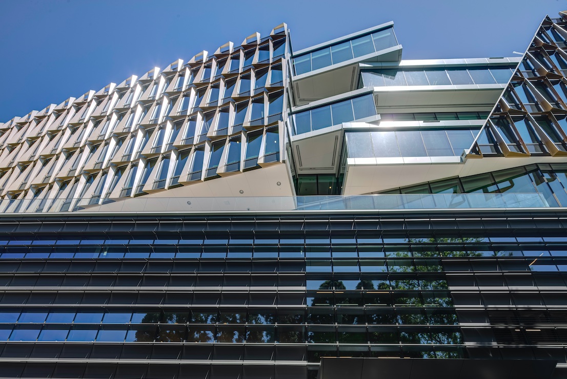
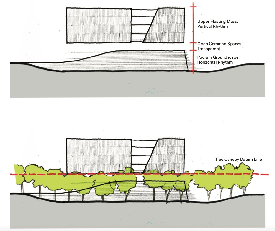
Situated on the historic land of the indigenous Gadigal people, the building incorporates landscaping elements in accordance with the university’s Wingara Mura design principles. A tripartite massing strategy, with a podium and upper volume sandwiching a layer of common spaces, helps to organize the multi-pronged program in a legible manner, while also ensuring that the different departments had easy access to outdoor space. Foremost among these, said Benjamin Gilmartin, partner at DS+R, is the Upper Wakil Garden, which adapts a traditional college yard for the vertical format. A “cleave” in the upper volume, Gilmartin added, “draws light down into the garden throughout the year, while its interlacing circulation acts as a connective tissue between academic workplaces and clinical spaces within.”
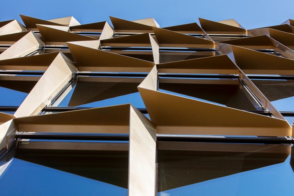
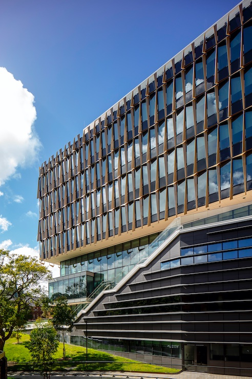
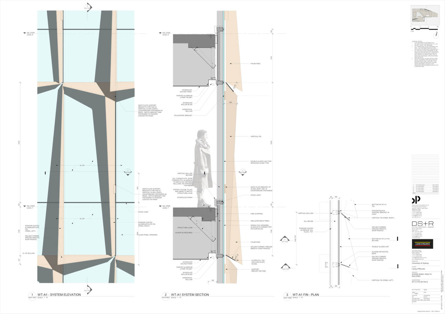
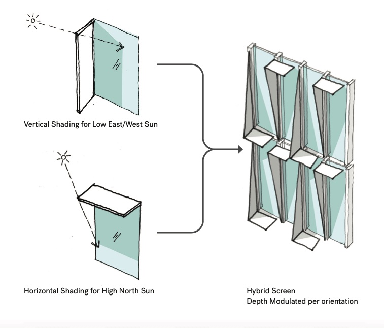
Simple glazing wraps much of the ground-floor podium, although this is supplemented in areas by horizontal ceramic panels and aluminum screens. A large, multistory volume rests atop this podium, with angular shading panels distinguishing the former from the latter. These deep-yellow porcelain fins are 5′-9” wide and are hung from the slab edge with concrete embedded brackets. Repeated over large spans of the buildings, the standardized facade elements create a subtle, but palpable rhythm.
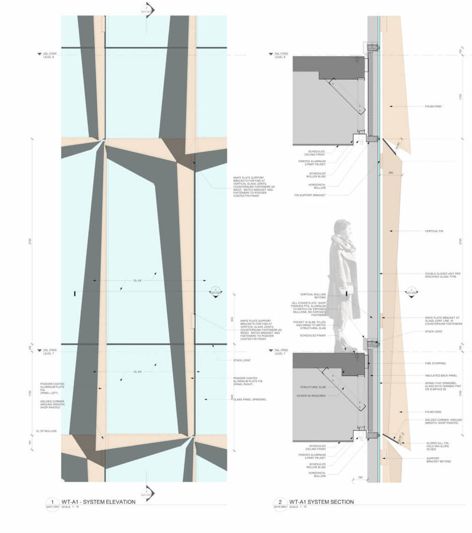
While the end result is elegant, arriving at the correct solution was anything but simple. “We found it challenging to fine-tune material selection and colors from a distance,” said DS+R associate principal Holly Deichmann Chacon. “We realized that the sunlight in Sydney has a different quality than in New York…and we needed to be on site to make decisions appropriate for the building.”
For this reason, DS+R relied on the expertise of facade installer Onsite Group, which contributed input on the modeling of the individual fins. “Performing sun studies of the metal fins of the upper boxes was essential and required 3D modeling,” added Deichmann Chacon. “The objectives were to design a screen that felt almost like a textile that wrapped the building, create a facade that changed with the perspective of the viewer, design a modular system, consider ease of installation, minimize visibility of movement joints and minimize visibility of fasteners.”
