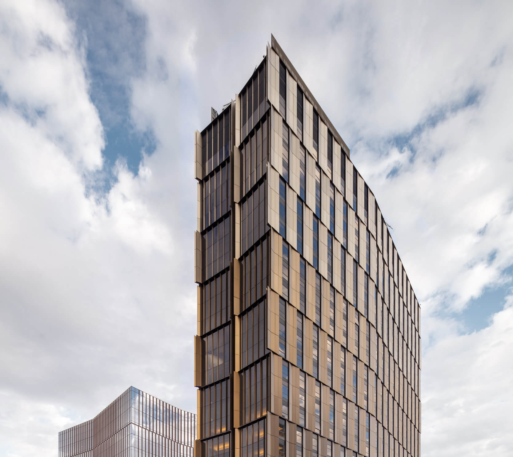
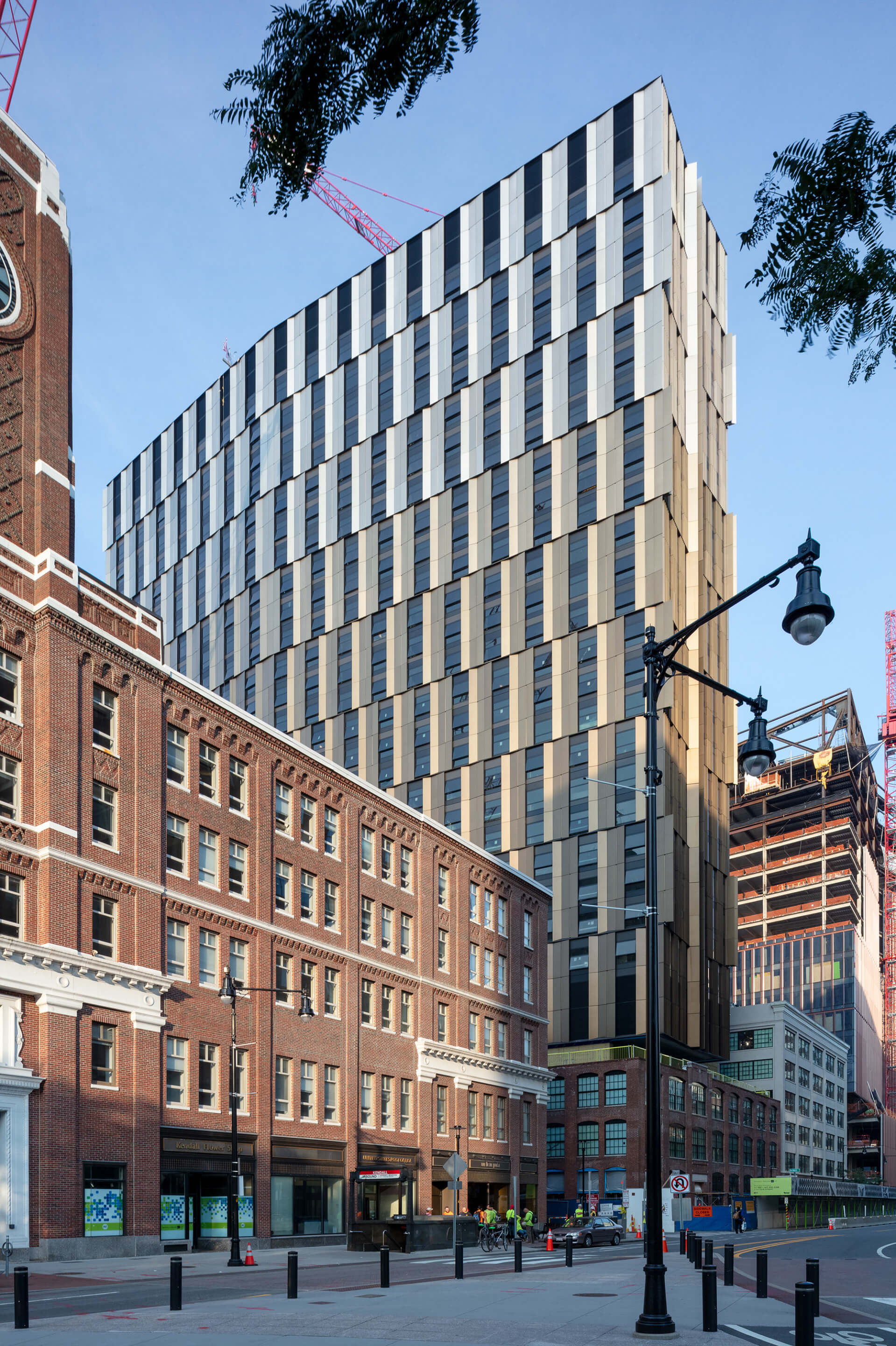
From the beginning, MIT Site 4, a new 29-story graduate residential tower in Cambridge, Massachusetts, was conceived by its architects as an icon. But not just any icon, said Nader Tehrani of the architecture firm NADAAA; the project, one of several being developed concurrently by MIT in the Kendall Square neighborhood, needed to both anchor this inchoate skyline and be “more stealth, almost inconspicuous.”
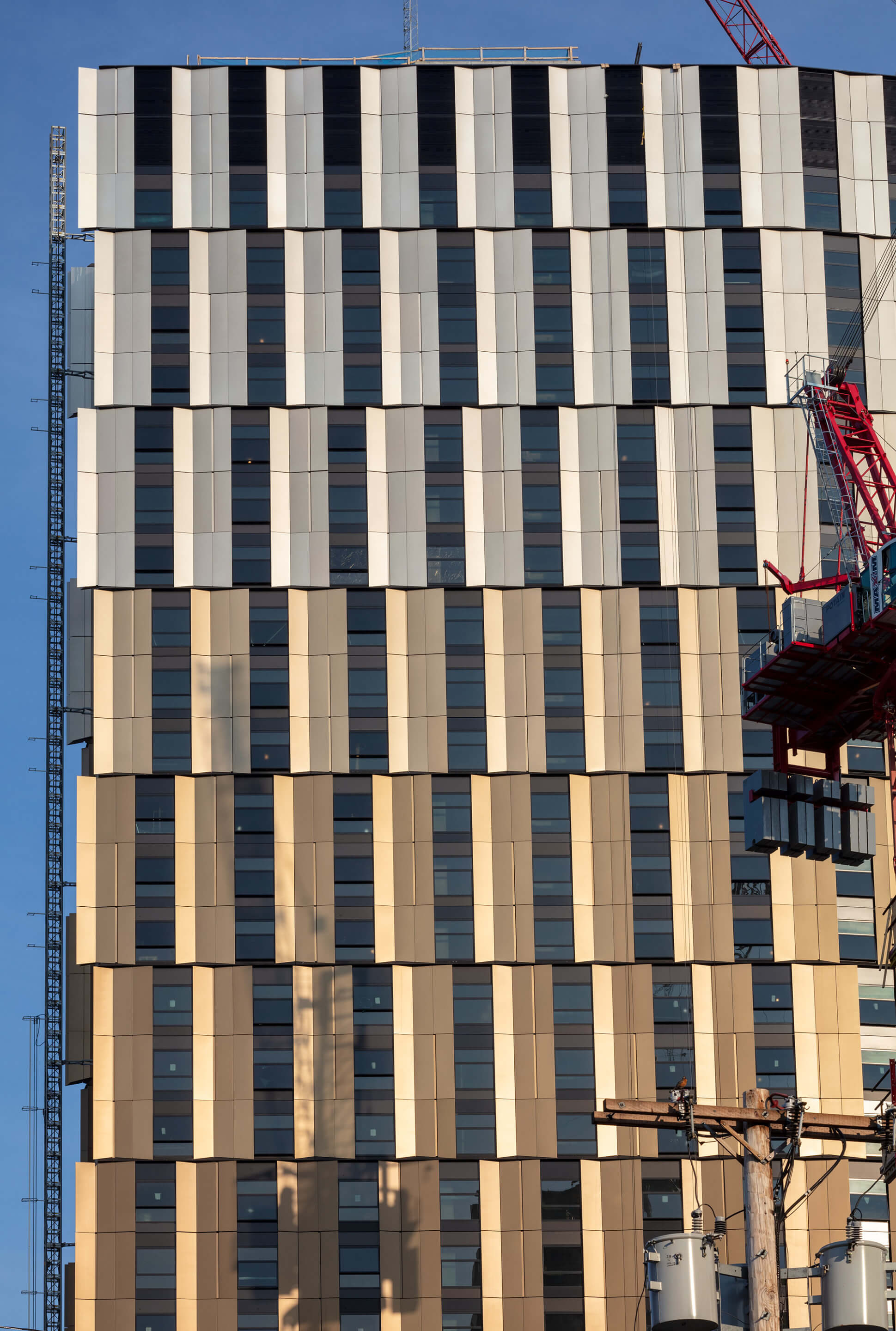
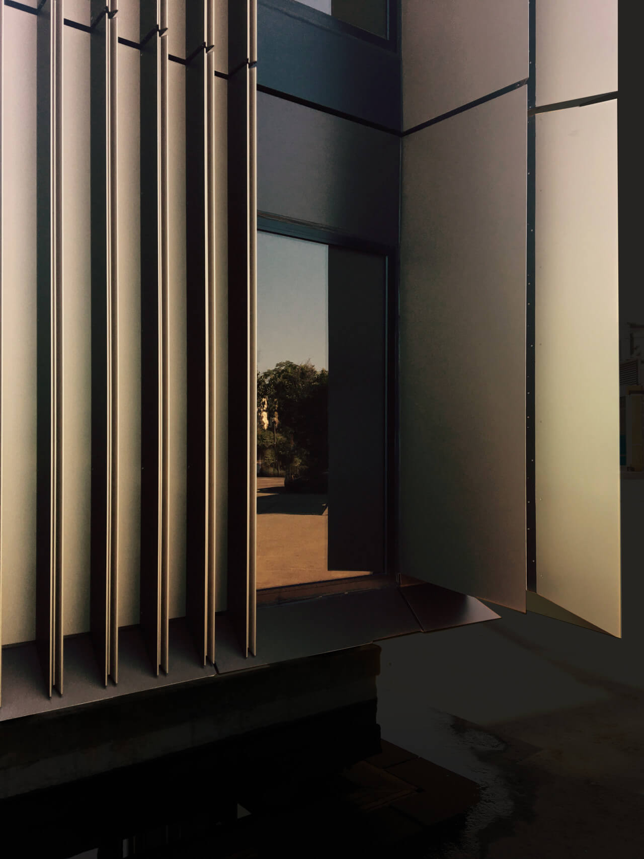
Contemplating this paradoxical aim, Tehrani reached for an old bit of sleight of hand. Because the lozenge-shaped tower was oriented east to west, its broad sides would be visible up and down Main Street—the opposite of inconspicuous. Breaking up those exteriors into alternating bands of glass and anodized aluminum unitized panels would give the eye more to do, but staggering them, the NADAAA team discovered, would trigger a sensation akin to the cafe wall illusion. Color gradations in the paneling and their concave depressions, which produce subtle shadowing, reinforce the feeling of variability.
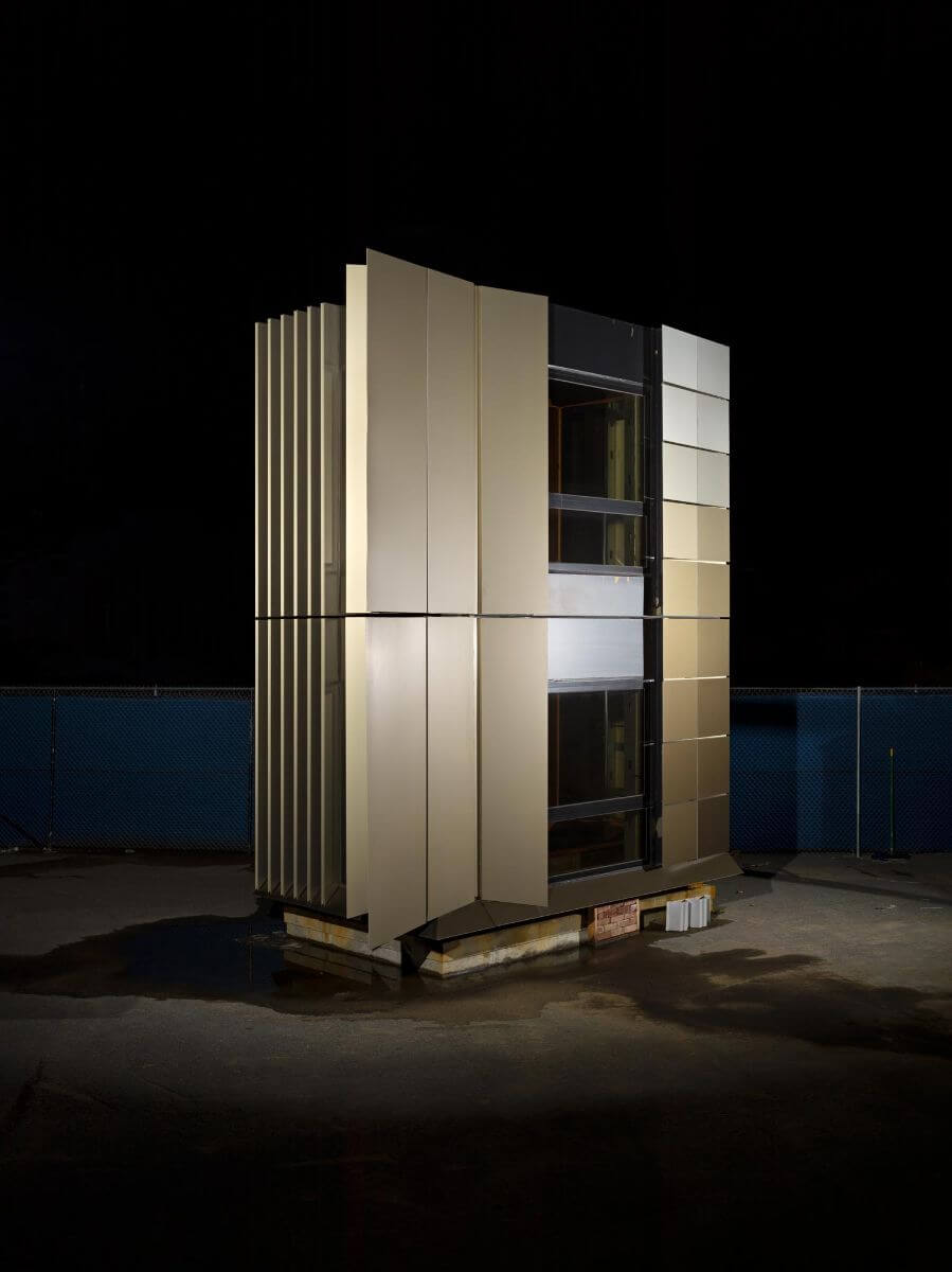
As it takes on increasingly bigger commissions, Boston-based NADAAA has reconciled craft-forward thinking with the economies of scale expected of most large job sites. At Site 4, the aluminum panels are enormous—each is 10 feet tall, anywhere between 15 and 29 feet wide, and weighs 4,200 pounds—yet they are arranged like courses of masonry. Pushing the comparison further, they dagger at the tower corners like coppery quoins.
Tehrani likens the scale of the panel segments to that of triple-deckers, the distinctive three-story houses that dot Cambridge. But a more literal rootedness in history and context occurs at Site 4. Its bronze trunk rises from the shell of a 19th-century brick warehouse whose envelope needed to be stabilized after its internal structure was blown out. Next followed a feat of structural ingenuity; half of MIT’s six Kendall Square projects rest atop a common subterranean base, so a concrete slab was poured at grade during excavation to allow for the simultaneous construction of the tower above. At the fifth story, a hybrid system of concrete and steel trusses cantilevers to the north and south and supports an orthogonal grid of cast-in-place floor plates and columns.
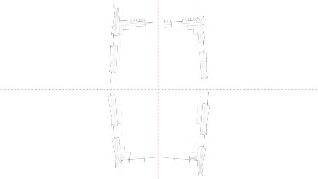
Initially, NADAAA specified three-story-tall panels for Site 4’s facade, but feedback from fabricator Island Exterior Fabricators and facade consultant Studio NYL prompted a change of tack. Instead of vertically oriented panels, horizontally stacked panels would ease both transport (they readily fit on a flatbed truck) and installation, noted Studio NYL founding principal Chris O’Hara. The horizontal panels, he explained, “were installed at a pace of one floor per week and were mounted at the head and hung from the floor above using a J-hook assembly that was developed to permit adjustability of 1 inch in each direction.”
The result is an icon that resists the label, magnetic in its pull but not smothering. This is so, Tehrani suggests, because “the building presents a silhouette that is not so much the result of a willful composition but the natural consequence of a tectonic decision.”
