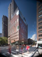
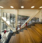
Manhattan’s Yorkville neighborhood is something of an idiosyncrasy; it’s avenues are lined with a hodgepodge of towers from the turn of the century onward, and the side streets are a mix of townhouses and walk-up tenements. There is no straightforward design methodology for contextual development here, but Toronto’s KPMB Architects raised the bar with an 83,500-square-foot expansion of the Brearley School, which joins the scene with Roman-style red brick and playfully arranged, chamfered windows.
The Brearley School school was founded in 1884 and after several moves ultimately landed in this corner of Manhattan. The following decades led to further growth, and the school accrued a multi-building campus centered on 83rd Street and East End Avenue. KPMB’s intervention consolidates the Lower School into one building and now houses administrative functions.
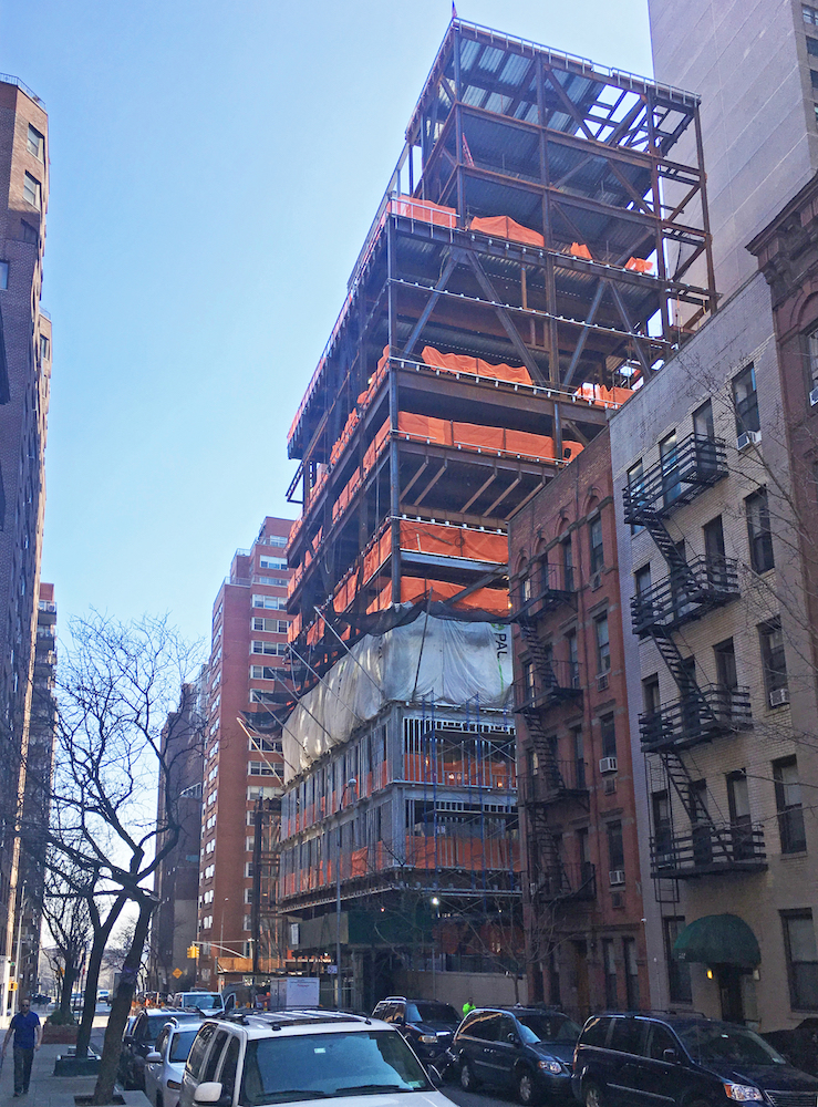
The primary existing school building, an Art-Deco style purpose-built structure dating from 1929, was a point of reference for the design team. “The goal and directive was to make the new vertical campus feel like it belonged to the school, which would now be a campus of buildings instead of a singular building; this didn’t mean copying the existing building, it meant understanding the spirit,” said KPMB senior associate David Constable. “When we looked around the area, which is predominantly brick, we didn’t really see very many inspiring brick types, so we opted for a Roman format brick which gives a slight variation on scale compared to the adjacent buildings.”
The tower cuts a slender figure as it rises from a glass podium tapered at its avenue-facing corners. This transparency at ground level both establishes the expansion as a ‘gateway’ to the school and highlights the building’s structure with highly visible and intersecting piers. The facade transitions to hand-laid brick above the atrium; prefabricated panel options and curved brick features were considered during the design process but were ultimately determined to be ill-suited for the project. Visible horizontal seams at each floor slab are both expansion joints and isolate areas between cavity and rainscreen to address pressure differential issues.
The placement of windows is dense between the third and fifth stories and responds to the daylighting needs of the classrooms found there. Each window surround is canted at their top and bottom, a stylistic effect carried over to the larger and asymmetric windows associated with auditorium and music rehearsal spaces.
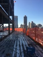
Located on a relatively small 75-foot by 100-foot lot with fairly stringent city zoning, laying out the building’s programming and structural system proved a particular challenge for the design and structural teams. “The diverse program coupled with city-mandated setbacks was a real jigsaw puzzle; all in all this made for interesting stacking with all floors above the fifth having no columns on the interior aside from the long core that occupies a 12-foot narrow strip along an interior property line,” continued Constable. “It is not always our first choice to put a 600-person auditorium seven stories in the air with a gym on top of it, but that’s what had to happen here.”
