- Architect
CO Architects - Executive Architect DFDG Architecture
- General Contractor
DPR Construction - EIFS Stucco
Dryvit Outsulation Plus MD system - Glass
Viracon - Landscape
Floor Associates - MEP Engineer/Lighting Designer
Affiliated Engineers (AE) - Structural Engineer
Advanced Structural Engineering - Civil Engineer
WOODPATEL - Acoustical, Audiovisual, IT Systems Consultant: Jeremiah Associates
Rising three floors in the Sonoran Desert, CO Architects Health Futures Center (HFC) at Arizona State University sets a modernist-inspired tone for the school’s developing 24-acre campus in Northeast Phoenix. With views of the McDowell Mountains and central Phoenix, the HFC is the first purpose-built iteration of the University’s collaboration with the Mayo Clinic. With spaces for research, meetings, conferences, and instruction, the building covers 145,200 square feet in a landscape of creosote, bursage, and Palo Verde trees.
Produced in collaboration with DFDG Architecture, the HFC’s facade is designed around the extreme heat of the local climate. While CO Architects Associate Principal Tanner Clapham said that the building’s design was not drawn from specific Modernist precedents, “one project [we] discussed during design was Le Corbusier’s Ronchamp, specifically its windows into the chapel,” revealing the building’s form through light and shade.
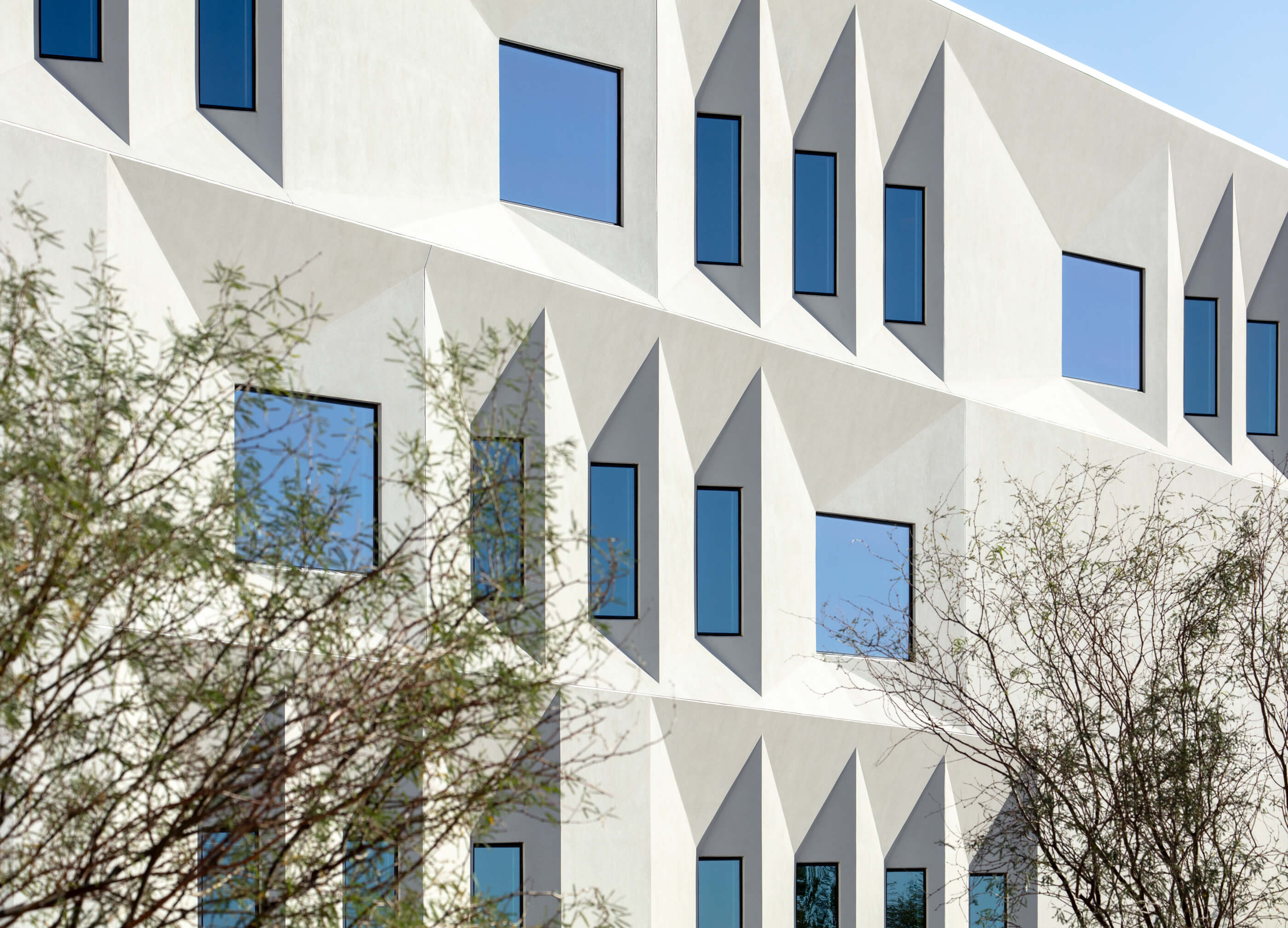
The facade’s trapezoidal shape, undulating horizontally across the ecru External Insulation and Finishing Systems (EIFS) stucco exterior, was designed to limit solar heat gain and glare. This is achieved through angling the glazing to face north on the east and west facades, while still allowing sunlight to reach the interior. Clapham said that energy modeling showed this design to limit solar heat gain by 35 percent annually.
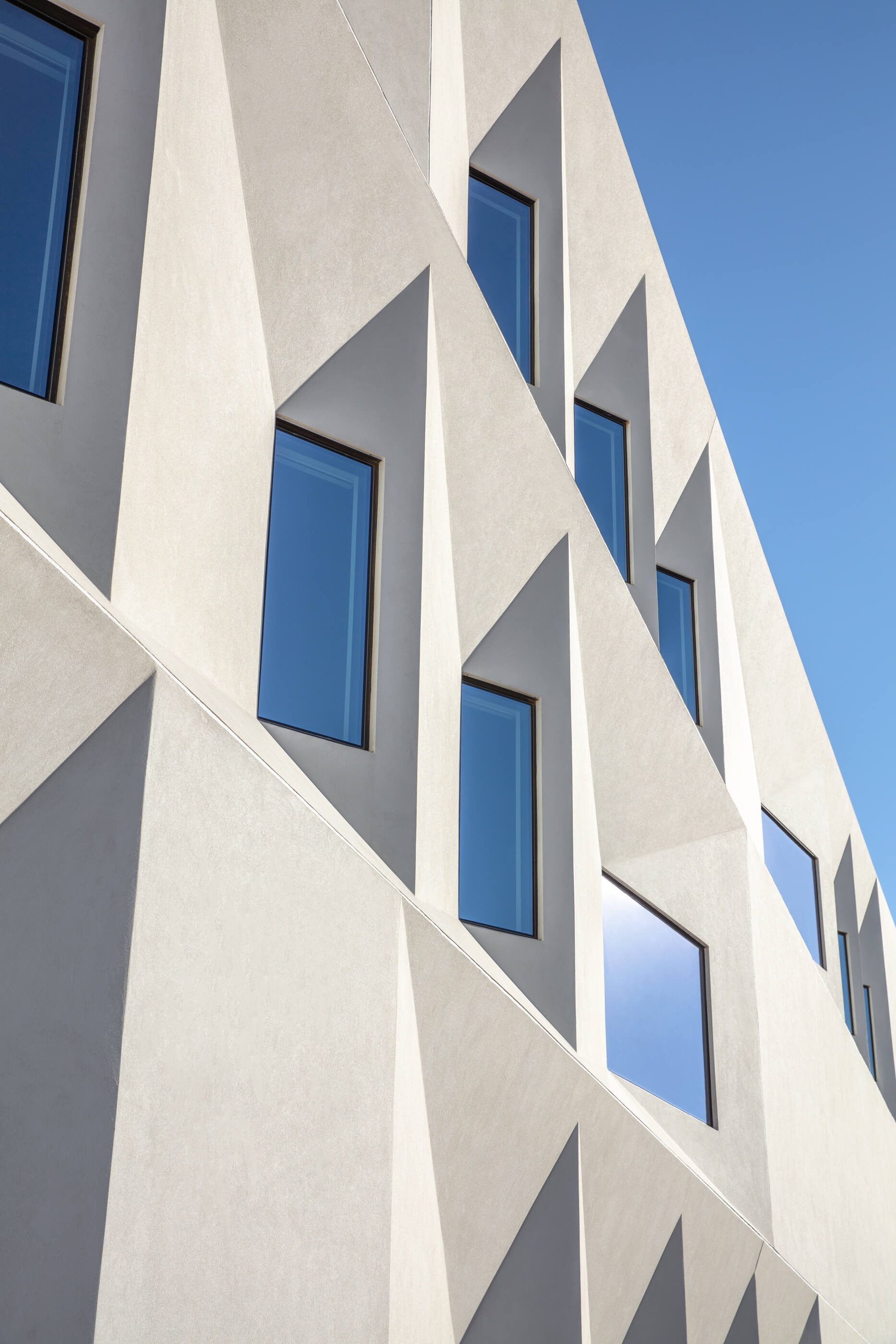
CO Architects used parametric design, allowing them to “assess the feasibility of design adjustments in real time,” said Clapham. Seeking to verify the viability of the facets that fold into the building, the design team used a custom tool developed with Dassault Systèmes’ 3D Generative Innovator to model the geometry of the window openings and wall angles. Incorporating framing, insulation, and finishes, the tool was able to provide insight into the feasibility of construction as varying designs were experimented with.
With the facade’s geometry providing shading, and different shadows of patterns emerging throughout the day, the ecru color was chosen to provide a “neutral canvas,” keeping focus on light and shadow while responding to the Arizonan heat. CO Architects also wanted to distinguish the HFC from nearby buildings, which are primarily earth-toned.
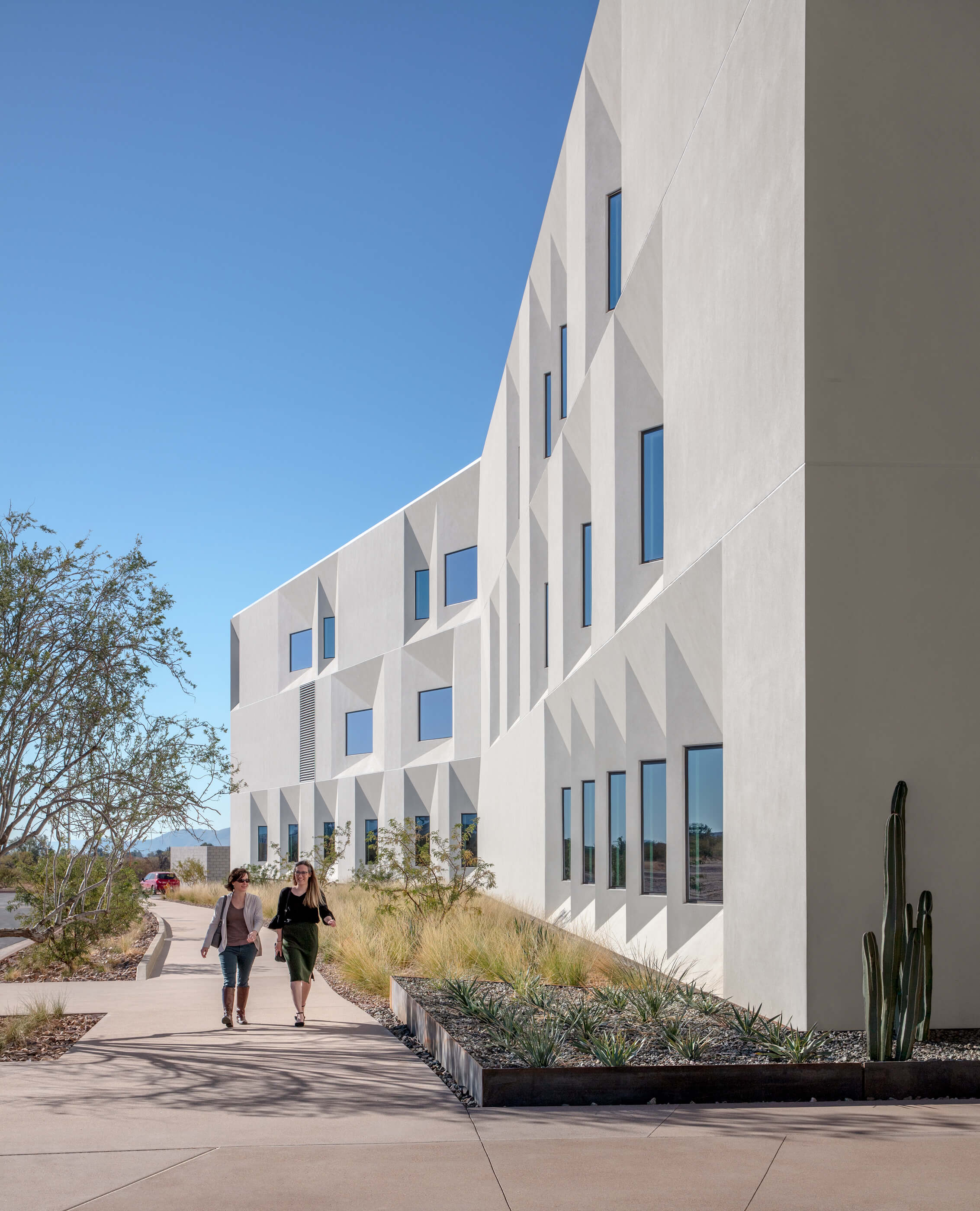
CO Architects worked closely with contractor DRP Construction, looking to streamline prefabricated facade components. This helped to further ensure the viability of construction, particularly in more geometrically complex moments of the building, with numerous full-scale mock ups testing constructability and performance metrics. Sections of the exterior skin were “prefabricated and assembled in jigs to increase accuracy and productivity,” said Clapham, and “complex interior geometries were modeled, and studs were ordered to size, reducing fieldwork and potential human error.”
CO Architects, alongside DFDG, worked with fabricators early in the design process to avoid later issues in construction. Collaboration with DPR, and its subsidiary, Digital Building Components, began during schematic design using parametric modeling. Working with collaborators earlier in the design process, and with models that were able to respond to design changes in real time, allowed for improved detailing in the design process while avoiding issues that may otherwise have been encountered further in the design process. Fabricators were included in developing final construction documents, and both CO Architects and DFDG meticulously monitored the performance of the mock ups, ensuring that design intent was kept while meeting performance standards.
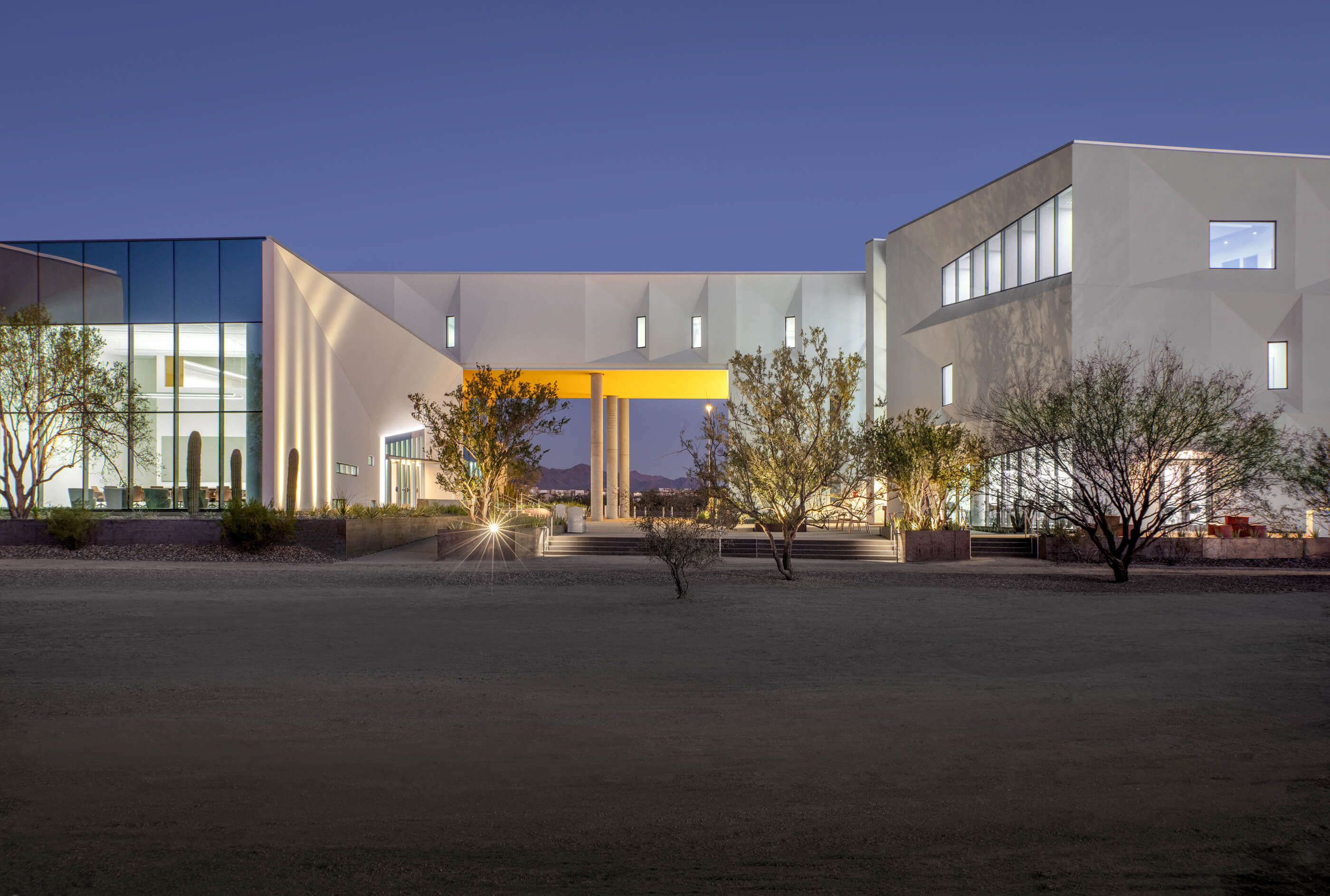
The clean profiles of the building were emphasized through the placement of mechanical systems on the interior rather than protruding through the roof. Mechanical equipment was placed at the southern end of the second floor, minimizing ducting and increasing the longevity of component parts that otherwise would have been exposed to intense sunlight. The resulting profile of the building reads more like a museum than a health center at times, breaking the oftentimes standard expectation that healthcare buildings are not welcoming or visually uninteresting. Voids at the ground level between sections of the building frame the McDowell Mountains, with a yellow-colored roof over the entry breaking the ecru mass of the rest of the building’s exterior.


