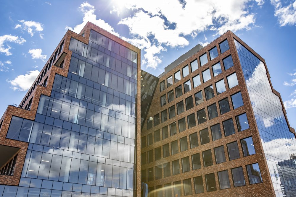
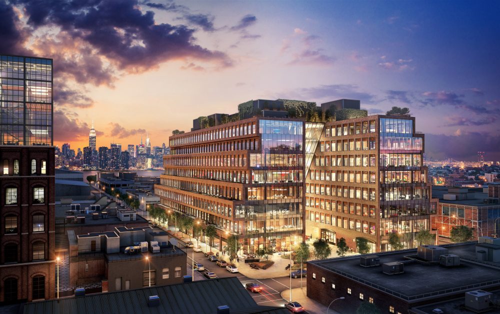
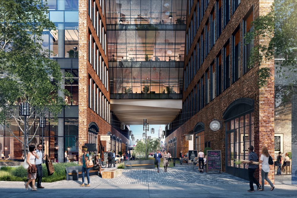
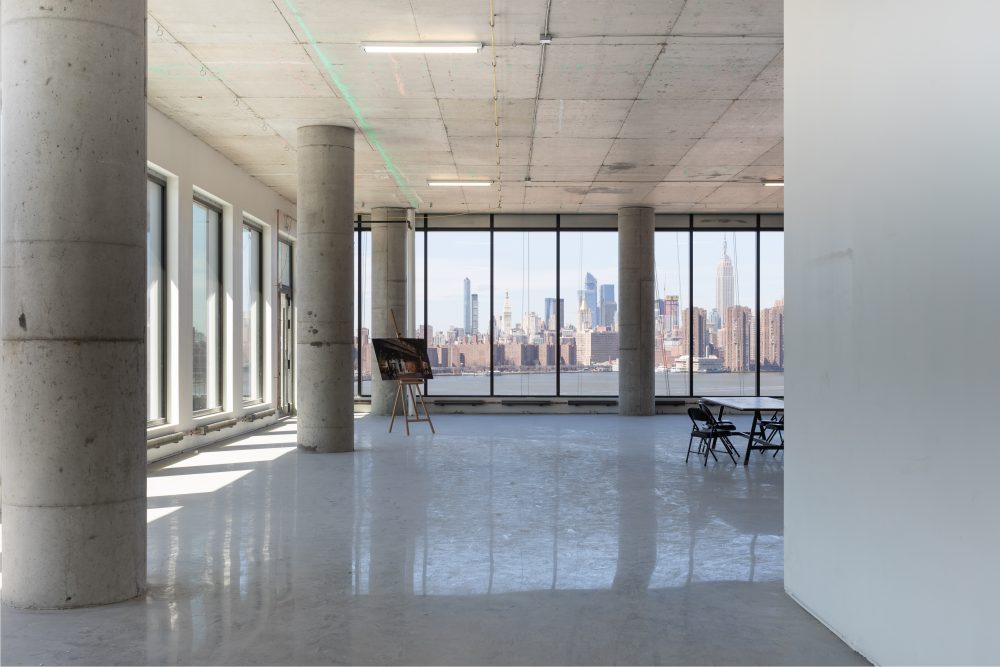
The Brooklyn waterfront is no stranger to development. Over the past two decades, swaths of post-industrial Williamsburg filled with warehouses and factories have been cleared in favor of glass-and-steel residential properties. One building, 25 Kent, an under-construction half-million-square-foot office tower designed by Hollwich Kushner as Design Architect and Gensler as Design Development Architect bucks the area’s cliches with its bifurcated facades of brick, glass, and blackened steel.
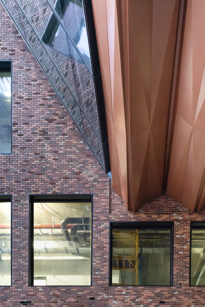
On a lot that measures 400 feet by 200 feet, the full-block project presents a formidable mass in comparison to its low-rise recent neighbors. Reaching eight stories, with floor to ceiling heights of 15 feet, the office tower is largely split between two staggered rectangular volumes linked by a hovering glass prism.
Combining these three materials is not inherently novel, but the mix presented challenges in meeting increasingly stringent sustainability and LEED goals. “In lieu of brick returns, an aluminum perimeter trim was used in tandem with thermally broken window to achieve the best performance in a practical and cost-effective manner,” said Yalin Uluaydin, senior associate at Eckersley O’Callaghan, the project’s facade consultant. “Similar issues were addressed at the interface of the east and west facing aluminum curtain wall and underslung curtain wall. Mainly we had to address the offset mullions and how the curtain wall end panels are set in a brick opening on three sides.”
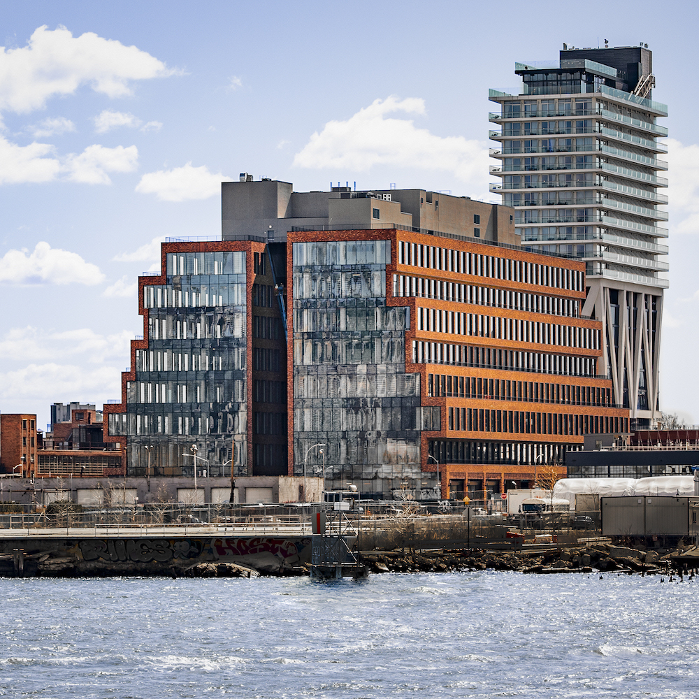
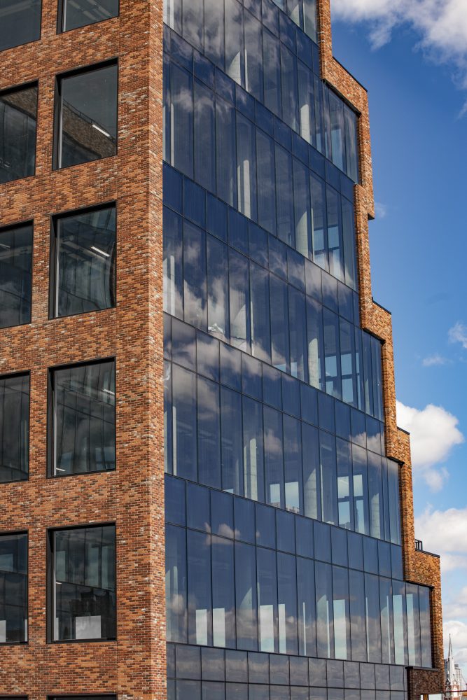
The structure’s facades are understated, rising with little in the way of outward ornament. The east and west elevations are clad in glass curtain wall modules tied to the structural slab edges with steel anchors.
For the side-street elevations, the design team nods to the surrounding historic warehouses with multi-tone brick surfaces. Successive floors, which protrude and recess like an overturned-ziggurat, are clad in a custom blend of bricks patterned in a stretcher-bond format. Punched mullion-free window openings, measuring eight feet by ten feet, are rhythmically placed across these elevations to further daylighting while mirroring the stylistic qualities of adjacent structures.
The windows, inset from the brick drape, are lined with custom ‘blackened steel’ finished aluminum. On the North and South streets, the retail storefront entrances are framed with printed ‘blackened steel’ aluminum portals, in a custom finish developed by Pure+FreeForm The portal details were brushed with silver pearl and treated with a patinated gloss matte layer, providing subtle iridescent qualities.pure
Proximity to the waterfront, although an amenity, also presented a structural challenge for the design team. “The foundation design is a continuous mat slab with thickened portions below the tower shear wall cores, and drilled tiedown anchors located outside the tower footprints to counteract hydrostatic uplift from groundwater,” said Gensler Design Manager & Senior Associate Anne-Sophie Hall. “To accommodate the architectural intent of the vast column-free space in the central region of each floor plate, each of the six columns supporting the bridge slab has a 20-foot long rectangular drop panel to achieve the desired long span with a conventionally reinforced 12-foot slab, while eschewing post-tensioning or similar strategies which would have entailed additional costs or specialized subcontractors.”
