Innovation center’s corrugated metal envelope evokes Boston’s seagoing past.
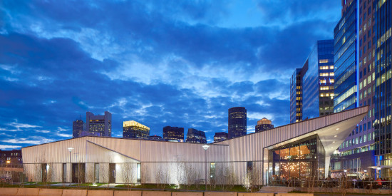
Commissioned to design District Hall, the centerpiece of Boston‘s emerging Innovation District, Hacin + Associates found themselves in a unique situation. “There was no context,” recalled design team member Matthew Arnold. “We were one of the first buildings down there; we had to build our own story.” To fill the gap, the architects looked to the site’s history. “In the old days, goods came from around the world to the Boston seaport, then were distributed throughout the United States,” said founding principal David Hacin. “We were thinking that this is analogous to an innovation center: ideas are born in this place, then distributed around the world.” Wrapped in corrugated metal punctuated by strategic glazing, its two volumes informed by nautical and railroad architecture, District Hall captures both the glory of Boston’s seagoing past and the promise of its high-tech future.

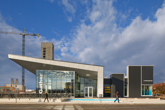
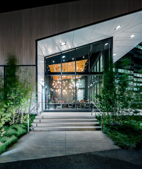
“The big idea behind District Hall was this two-part building,” explained Arnold. A bifurcated design served several purposes simultaneously. First, it allowed the architects to bring a different architectural expression to each side of the program. The larger, more sculptural volume, angled to define the edge of a planned park, acts more like a public space, housing an auditorium and restaurant. The lower, rectangular wing of the building, which is oriented to the existing street grid, contains the innovation center. Second, the two-part form complemented the project’s tight budget. “The lower portion of the building didn’t require the same level of ceiling heights” as did the auditorium/restaurant space, said Hacin. “We were trying to build volume where we needed it, and not where we didn’t need it.” On a conceptual level, the bifurcation taps into two elements of the city’s past. The taller volume’s swooping profile was inspired by nautical architecture, while the lower wing evokes the boxy order of a train yard.

- Facade Manufacturer
Morin Corp. (corrugated metal), Reynobond (flat metal trim) - Architects
Hacin + Associates - Facade Installer
Ipswich Bay Glass - Location
Boston, MA - Date of Completion
2013 - System
corrugated metal with flat metal trim and low-e glazing - Products
Morin Corp. corrugated metal, Reynobond panels, Kawneer 1600UT Curtain Wall System
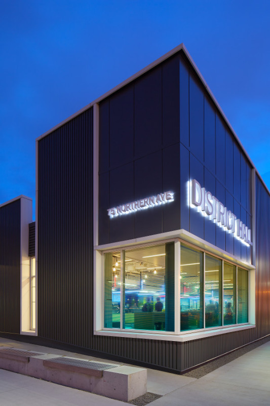
District Hall’s corrugated metal facade further emphasizes the building’s dual identity. “We found this corrugated material to be very intriguing,” said Arnold. “It’s related to nautical sheds and train cars.” Other corrugated facades have begun popping up around Boston, noted Hacin. “But they’ve used it for the industrial aesthetic, with no real idea behind it. It was kind of cheap, industrial, and cool, but that’s as far as it went.” Hacin + Associates instead deployed the material as a storytelling device, choosing two different patterns and colors to continue the narrative embodied in the building’s form. A shimmering silver metal extruded in a sine wave pattern encloses District Hall’s multipurpose wing, while the innovation center is wrapped in matte black with a more squared-off profile. In addition, the architects used flat white trim material to suggest three-dimensionality. “We developed a rationale for how to treat the facade details,” explained design team member Scott Thompson. “Where we cut into [the corrugated metal], we treated it as if it was a solid with a different center.”
The architects minimized glazing in part for budget reasons. “Rather than having lots of windows scattered around, we decided to concentrate them in key locations: at the restaurant, on the corner,” said Hacin. “It really is a showcase of the facade material. Sometimes it’s about the windows, but in this case the facade material is sculptural—you can see this especially on the silvery volume.” The conservative approach to glazing also helps reduce thermal gain. The architects primarily relied on tried and true methods, such as placing few windows on the south-facing facade, and setting the west-side windows back several feet, to meet efficiency goals. “We were really just trying to get the most out of conventional technologies,” said Thompson.
Ultimately, said Hacin, the true environmental test for District Hall will be whether it is razed in a decade, as planned, or whether it proves its usefulness as a long-term fixture of Boston’s Innovation District. “It was built to be a ten-year building,” he said. “But my hope is that it will continue to be successful, and that it will become part of the character of this neighborhood—part of what people love about it—in which case there will be no reason to remove it. That would be the most sustainable outcome of all.”


