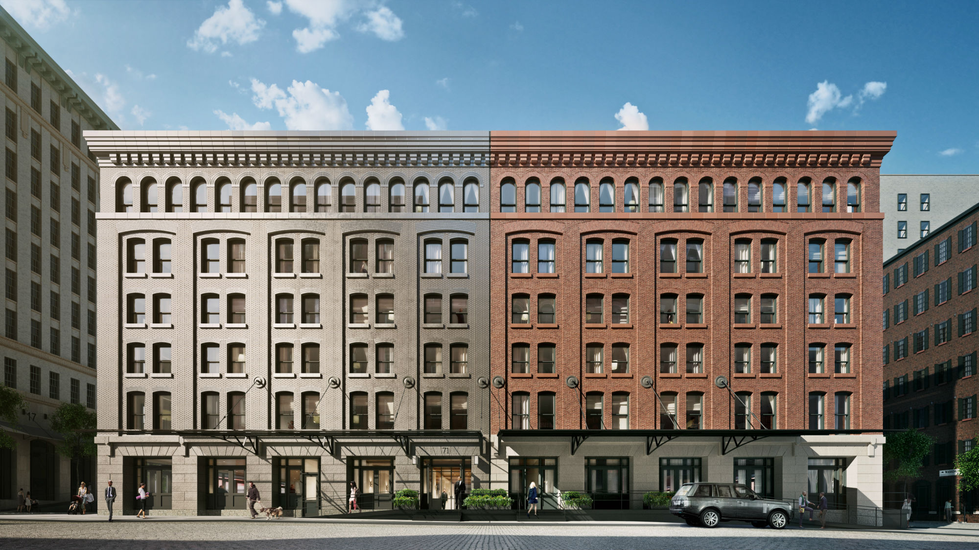
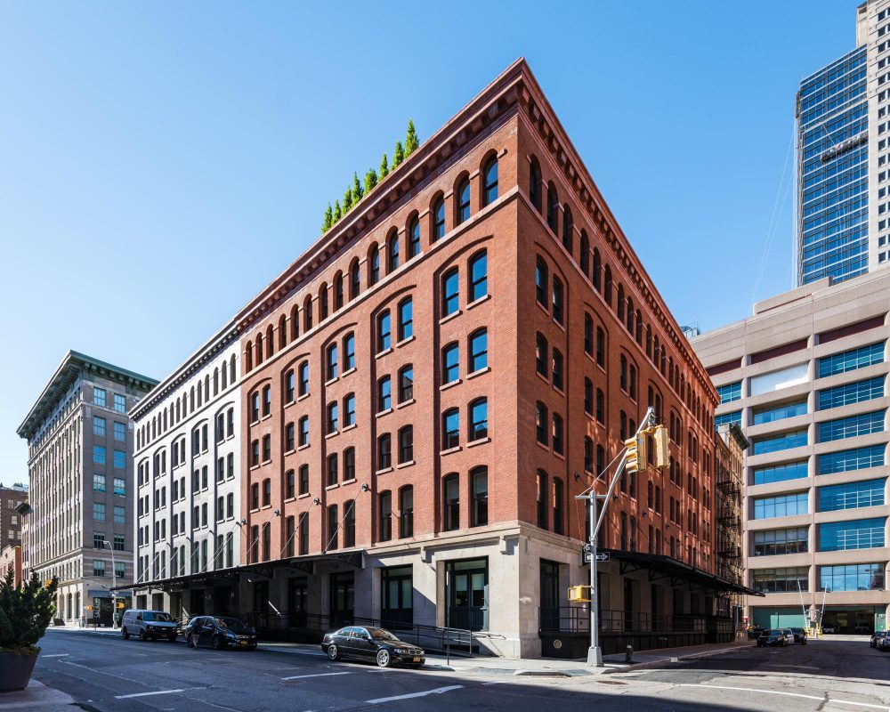
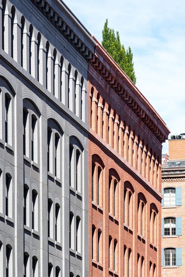
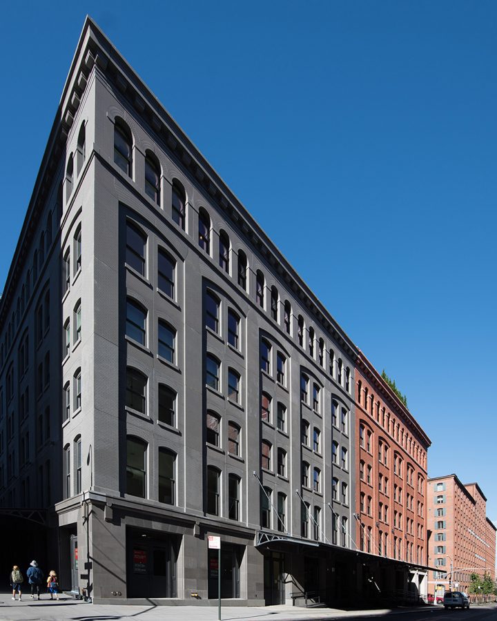
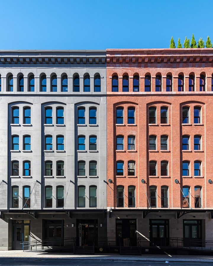
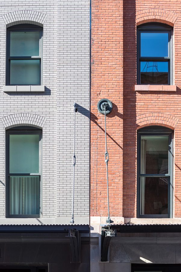
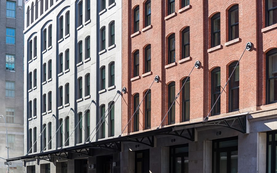
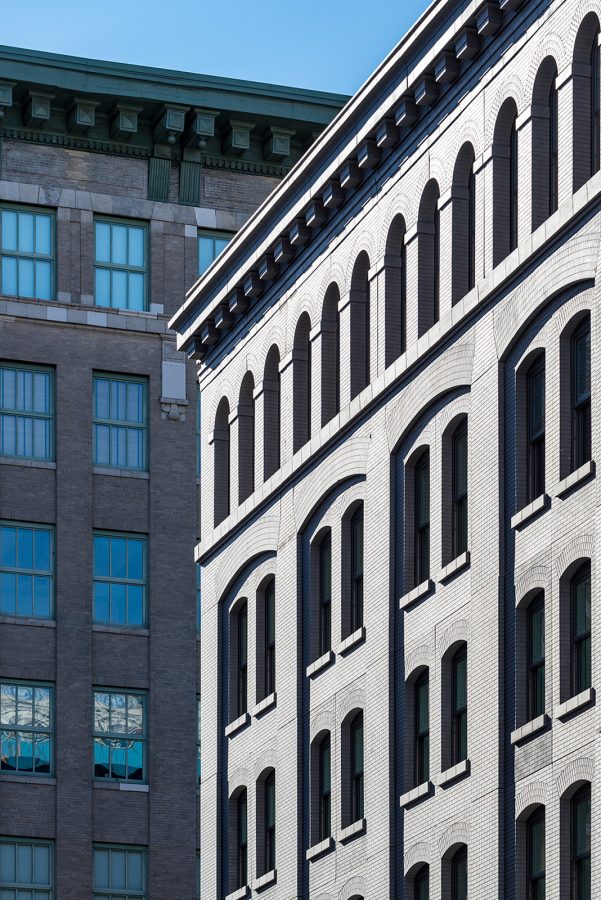
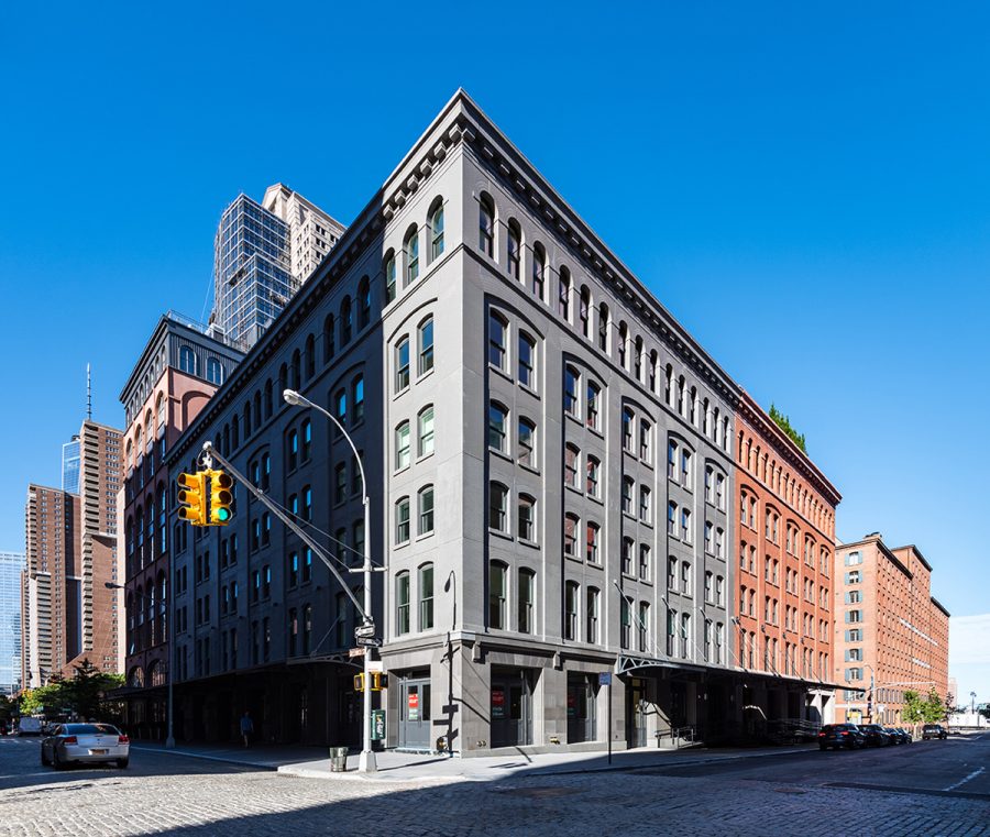
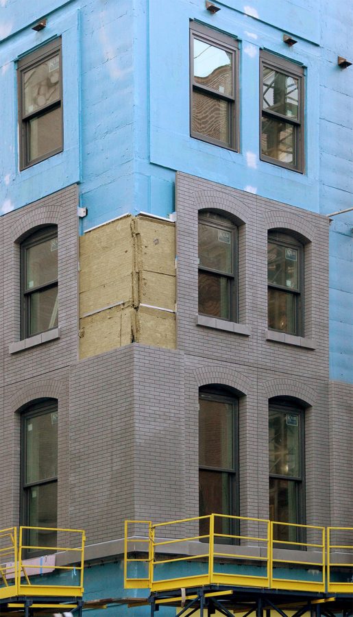
This new 33-unit condominium in New York’s historic Tribeca neighborhood is composed of two buildings, a restored and converted 1905 coffee and tea warehouse on Washington Street and a matching addition on Greenwich Street. The new building produces a “double negative” effect, with identical facade detailing rendered in a matte metallic finish.
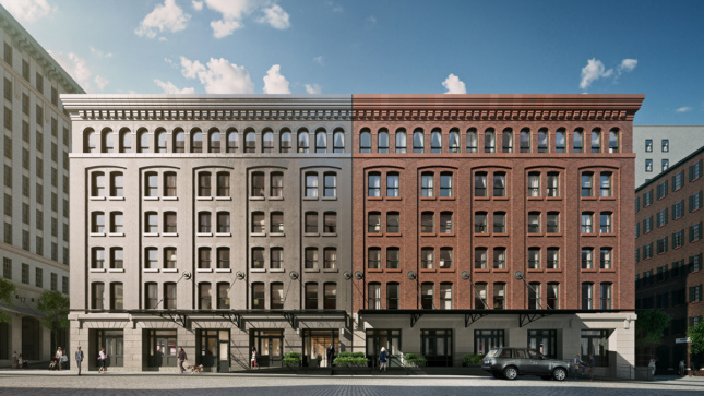
Wesley Wolfe, director of design at New York City–based Morris Adjmi Architects, said this concept of the direct copy was influenced by both contextual and cultural factors. “Warehouses in the district often were extended as their needs for more space grew. These additions would often mimic the style of the original warehouse.” Wolfe said the use of analogous materials is not uncommon, citing the tendency of industrial-era cast iron to replicate stone or brick. The project was also inspired by art and the idea of duplication in the work of pop artists like Andy Warhol.
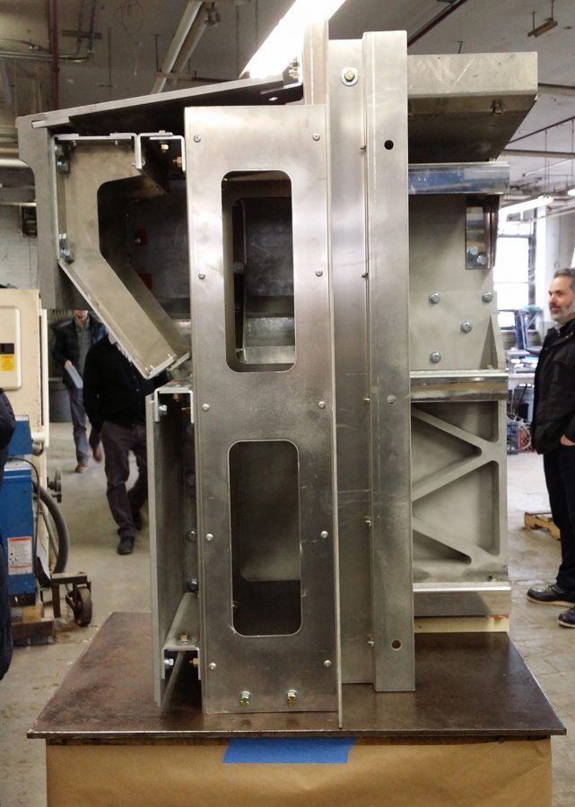
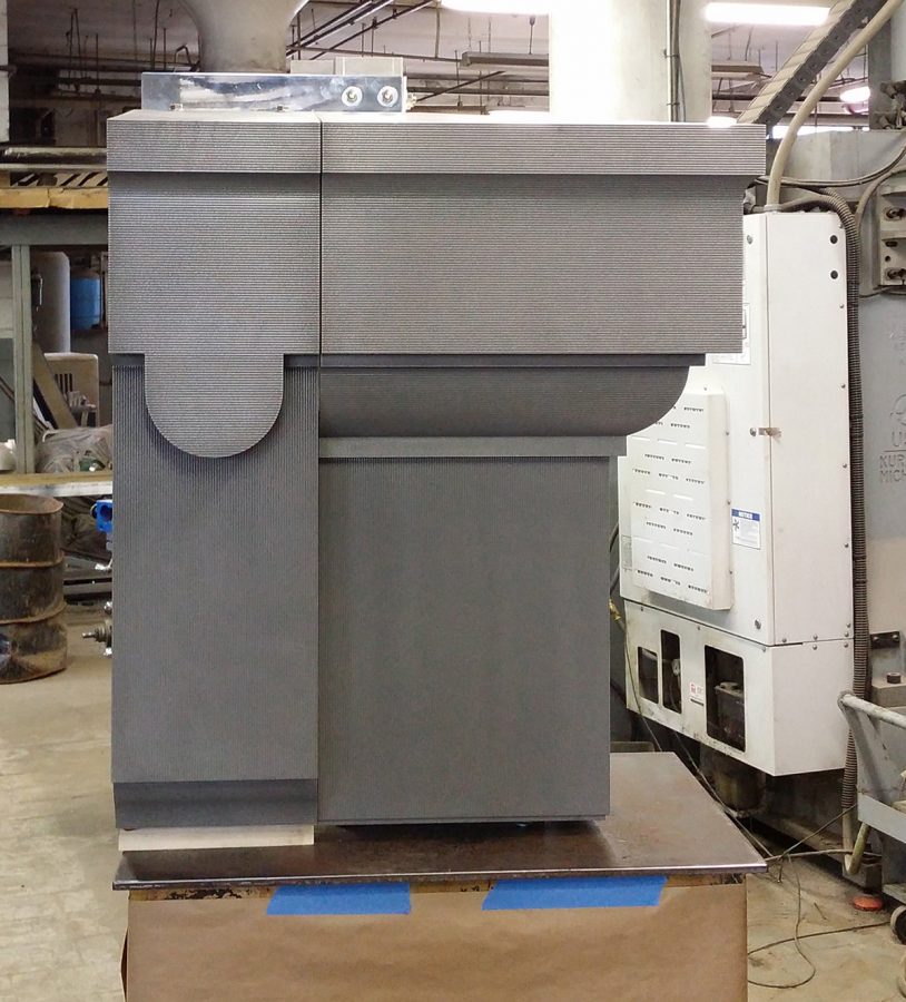
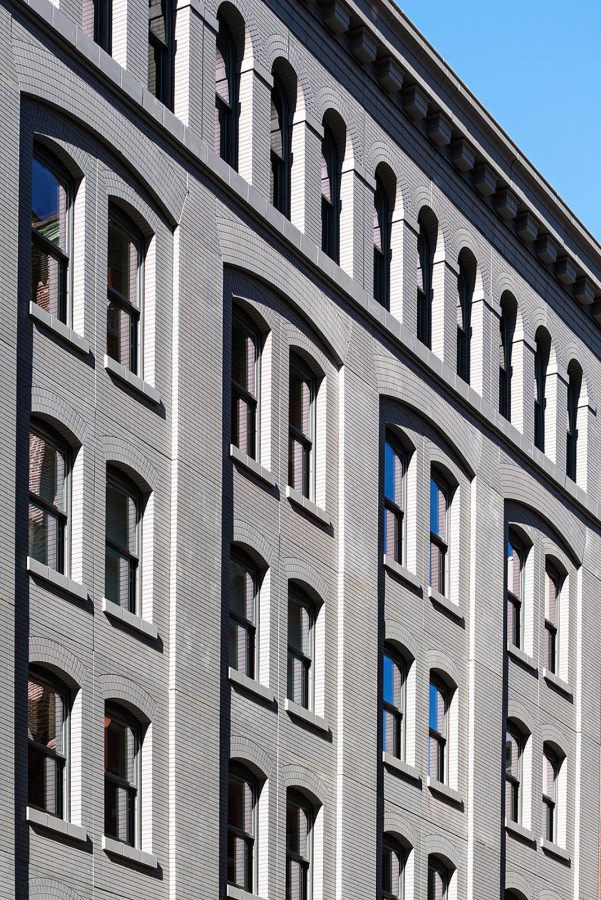
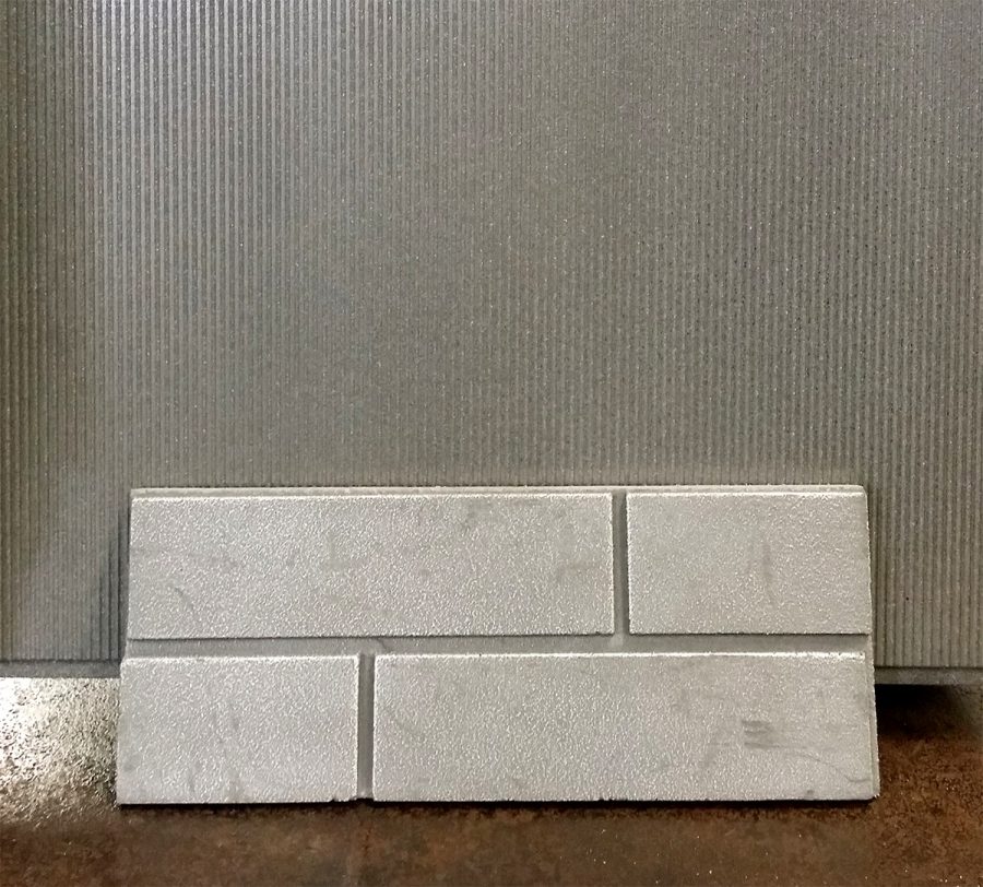
The project team used a combination of laser scanning and hand measurement to capture details in the base, middle, and top of the historic masonry facade. The base of the facade mimics it’s neighboring limestone masonry, employing a marine grade aluminum panel with CNC-milled patterns. The material is finished with a plasma flame spray involving a mixture of nickel and stainless steel powder. The cost of this premium material and finish limited its use to the ground floor of the building where it’s exposure is maximized to passersby.
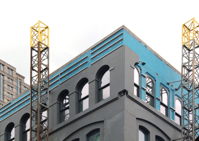
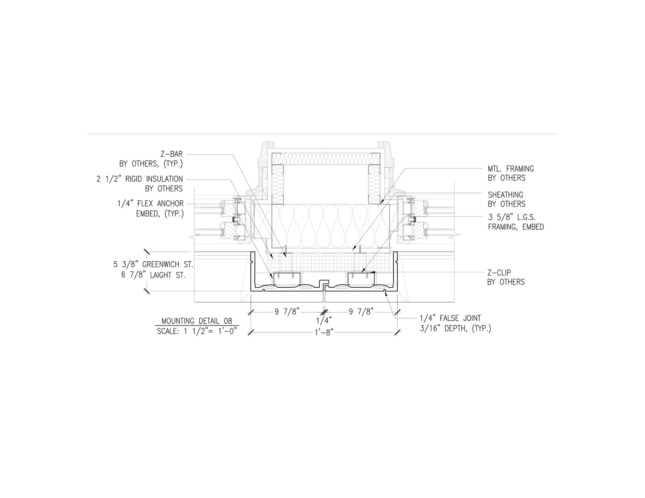
The upper floors employ a glass fiber reinforced concrete (GFRC) panel with spray on coating with aluminum particles that mimics the look of the plasma finish of the metal panels. The custom cast panels are installed onto the facade as a rain screen assembly using a standard clip and Z-girt system backing up to a stud wall. The facade is panelized with a “modular rationality” coordinated with the composition of the punched windows of the facade. An overlapping tongue detail developed by the project team helps to minimize panel joints.
Beyond the facade, a landscaped courtyard cut into the two buildings helps to connect the old with the new. The interior aesthetic parallels the two structures as well, offering rustic exposed finishes in the original warehouse and a more contemporary streamlined finish for the new addition.

