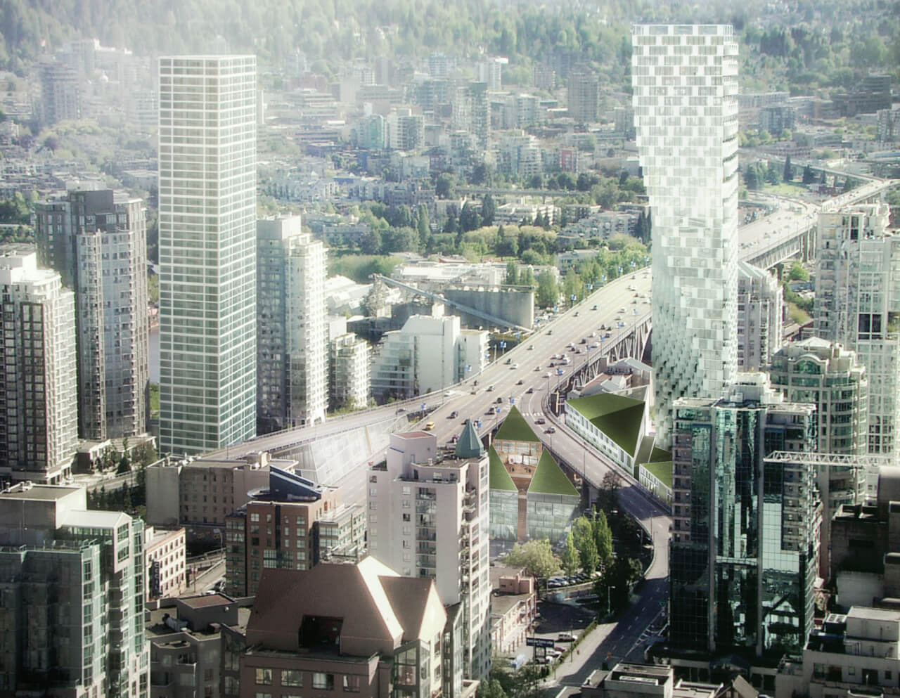
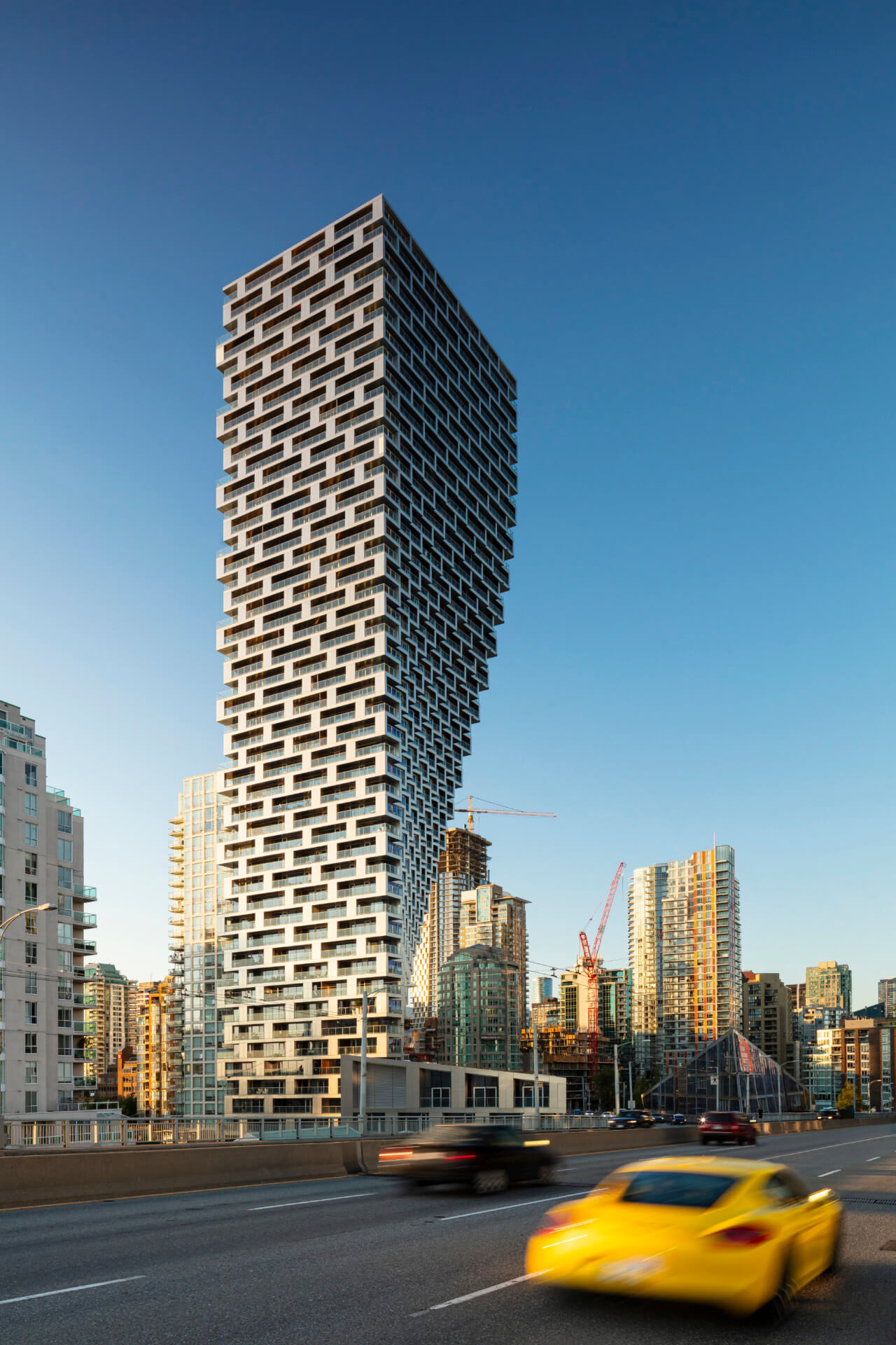
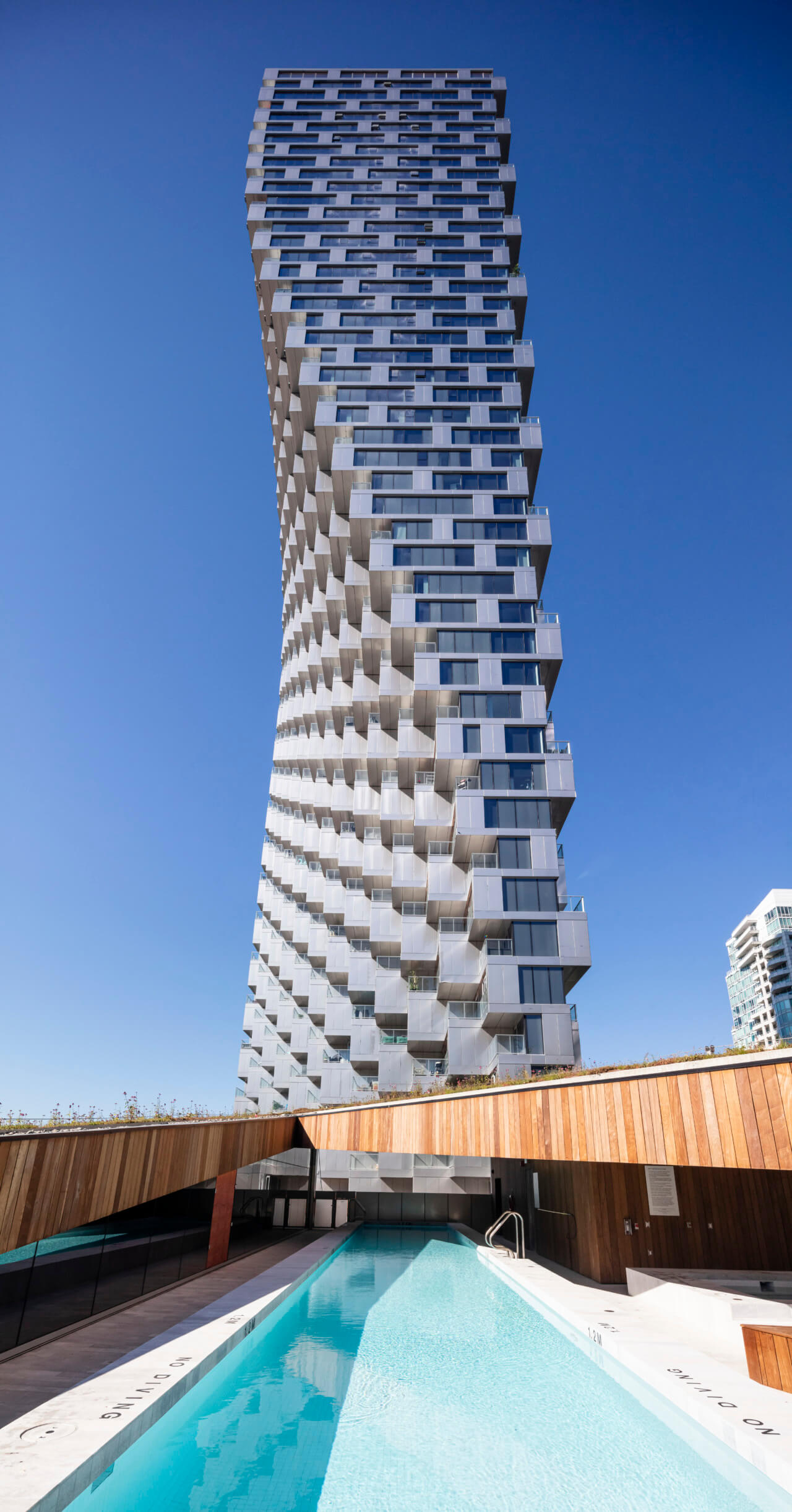
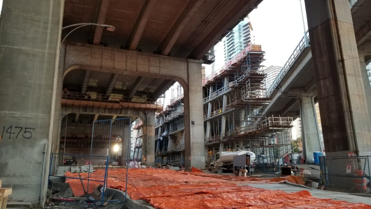
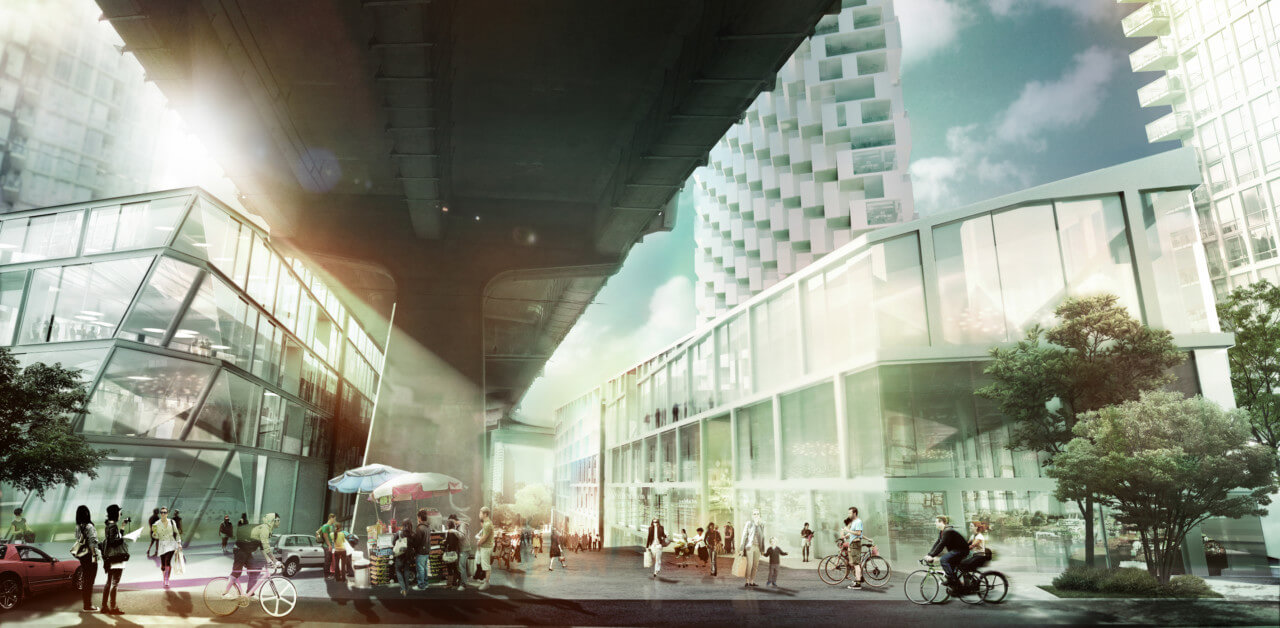
Architectural collaborations often arise from networking or crossing paths on site. In this case, it was by chance that Bjarke Ingels met Ian Gillespie, owner of Canada’s leading luxury development company Westbank, at a lecture series where the award-winning firm DIALOG Design was also in attendance. BIG worked with DIALOG and James K.M. Cheng Architects to produce a 497-foot-tall tower with three additional buildings on an extremely unique triangular site situated at the water’s edge where Granville Bridge meets downtown Vancouver. Nine years after the initial contract was signed, the carved-out Vancouver House stands in a grand gesture to its structural audacity and top-heavy technical feat. Often referred to as an “occupiable sculpture,” the LEED Platinum project, is also notable for also activating the pedestrian-unfriendly site (it was previously an impound lot). While visually striking, the three additional surrounding buildings add to the residential use for a total of 750,000 square feet consisting of amenities, retail, and commercial space.
Abiding by the city’s code that no residences can be within 98 feet (30 meters) of the bridge, the building rises from its small triangular site at the base and bends around the heavily trafficked bridge to maximize floor space. As the tower ascends, the floorplate expands in width 16 times and doubles in area consecutively, leaving a playful carve, seemingly unsupported, out of the 49-story building. With over 200 different unit layouts behind the undulating facade and custom curtain wall and window wall systems, there is almost nothing “standardized” about the Vancouver House.
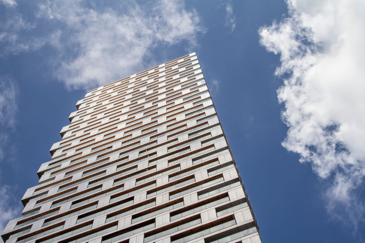
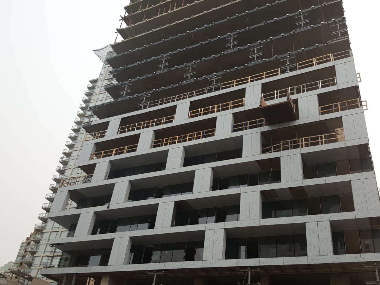
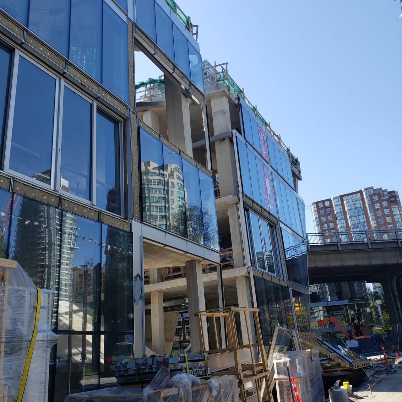
The “slipping brick” pattern of the facade highlights the second, but more subtle, challenge of the design: the continuity of facade treatment around the multitude of corner conditions the carved-out space creates. Considering all slabs were post-tensioned, the team could not put thermal breaks such as Isokorb between the exterior balconies. “We had to think of the facade as a sweater that went over the entire building including, all balcony projections. Undersides, edges, tops… they are entirely wrapped with thermal insulation, showing how the thickness of those frame elements work so well. They allow the balconies to project out while encapsulating the insulation and fits within the horizontal facade module,” explained Vance Harris, partner at DIALOG Design and project architect for the Vancouver House.
The facade, manufactured by Iljin, is composed of 2-millimeter thick marine-grade stainless steel panels with a bead blasted finish. The design originally called for copper or zinc to be installed where the “erosion” occurs, with the intent to convey a warmer tone compared to the overall outer skin. “Copper is one of those love and hate materials for architects… it’s so hard to get it looking the way you want it to on day one let alone day 100 or even 800,” said Harris. Designing with continuity as well as longevity in mind, the team ultimately landed on stainless steel due to the manufacturer’s unique control of the finishes. The “darker” panels within the carve are the same material with an additional titanium oxide coating.
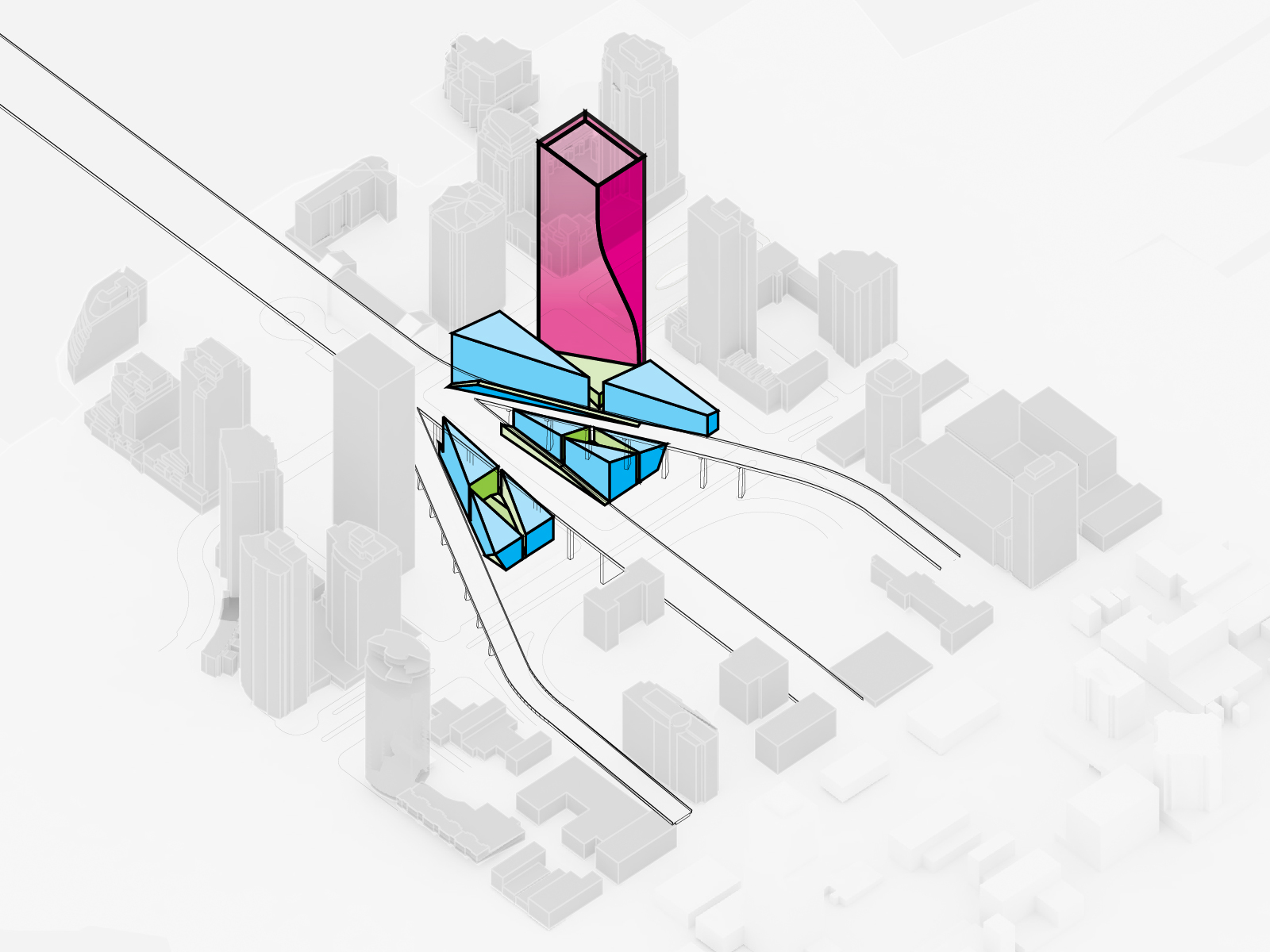
Nonlinear analysis from the structural engineers revealed that there was more of a twist than just the architectural design: With every floor added, the weight from the concrete poured imparted a twist to the degree of 2 inches all the way down. In the economic climate of development, typically the facade is installed and interiors are completed a few floors below the latest slab built as the project ascends. Here the facade was installed simultaneously to meet this demand as well as the twisting condition. While considering the live, dead, wind, and seismic loads, Vancouver House was intentionally built askew to accommodate for the movement of the building during construction. The weight of the structure was allowed to settle plum in position. At the northwest corner of the tower alone, Dialog Design was able to anticipate two feet of movement during construction. Given the complex nature of the envelope, all members from the structural, architectural, and even manufacturing team were at the table to collaborate on the unique systems for thermal insulation, air barrier, translation allowance within the window wall.
The two shorter mixed-use buildings use comparatively tamer curtain walls, but are enclosed with steel from the same supplier to further unite the microcosm neighborhood the four buildings make up.
“All of our assumptions about how to design a residential tower went out the window!” Harris jested. While redolent of a Minecraft-like digital twin, Vancouver House stands to impact the real world far beyond the visual skyline by bringing much-needed housing and program to re-invigorate downtown Vancouver.
