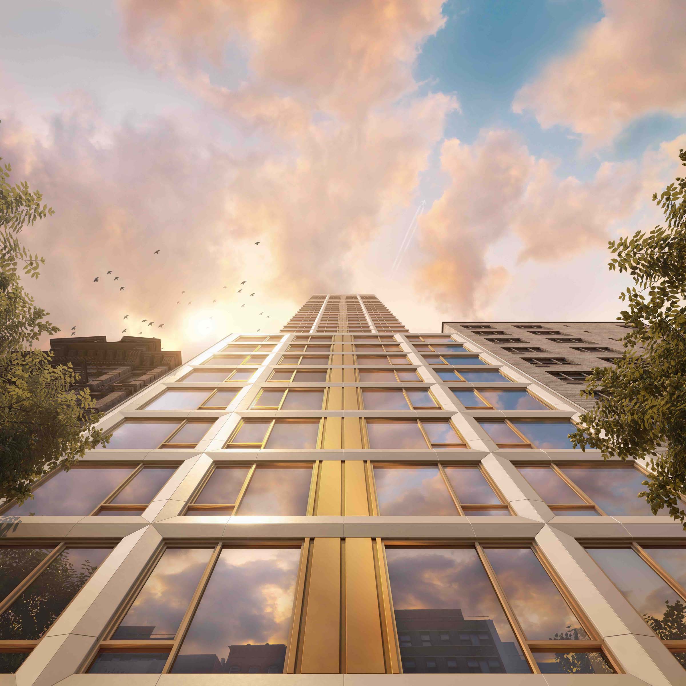
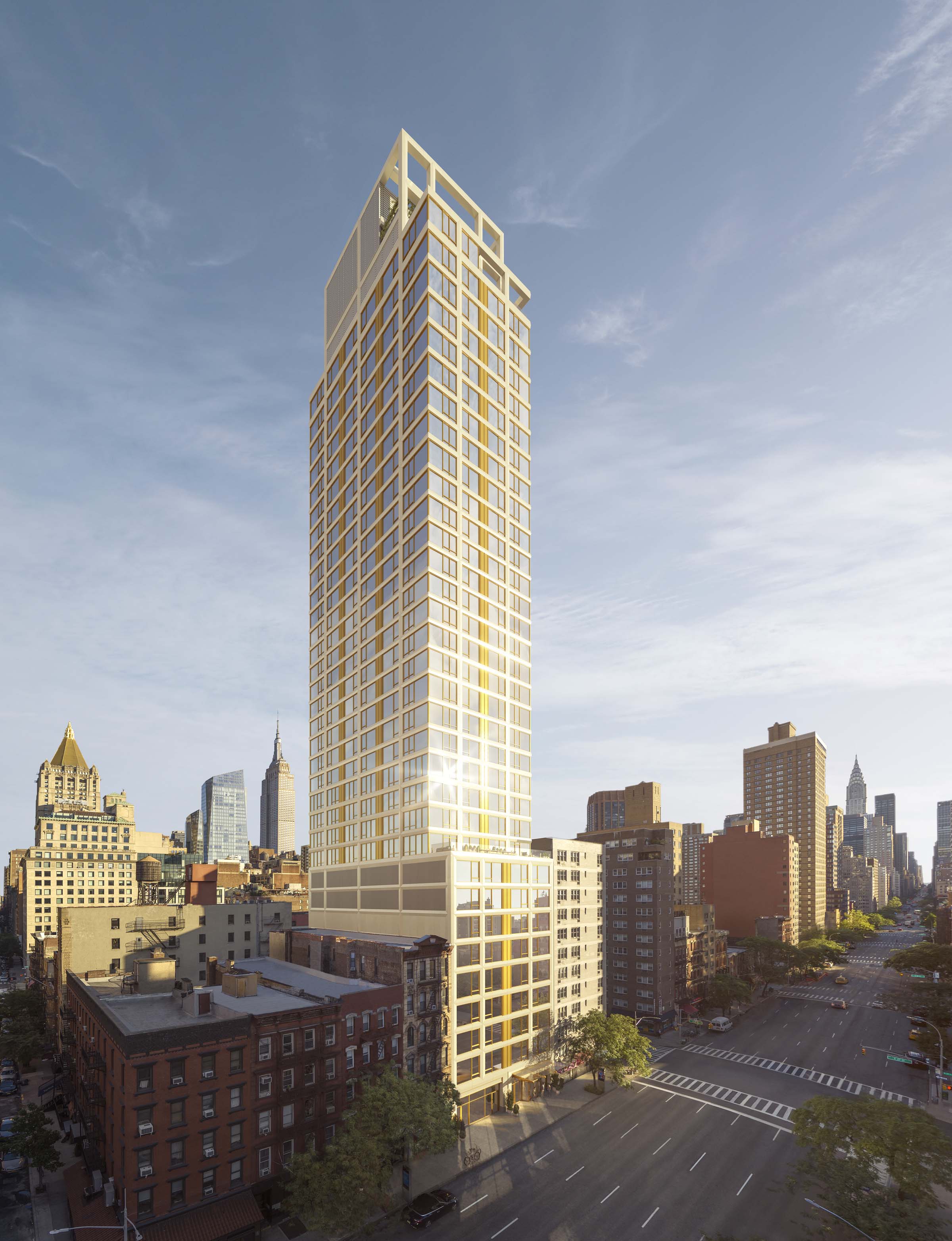
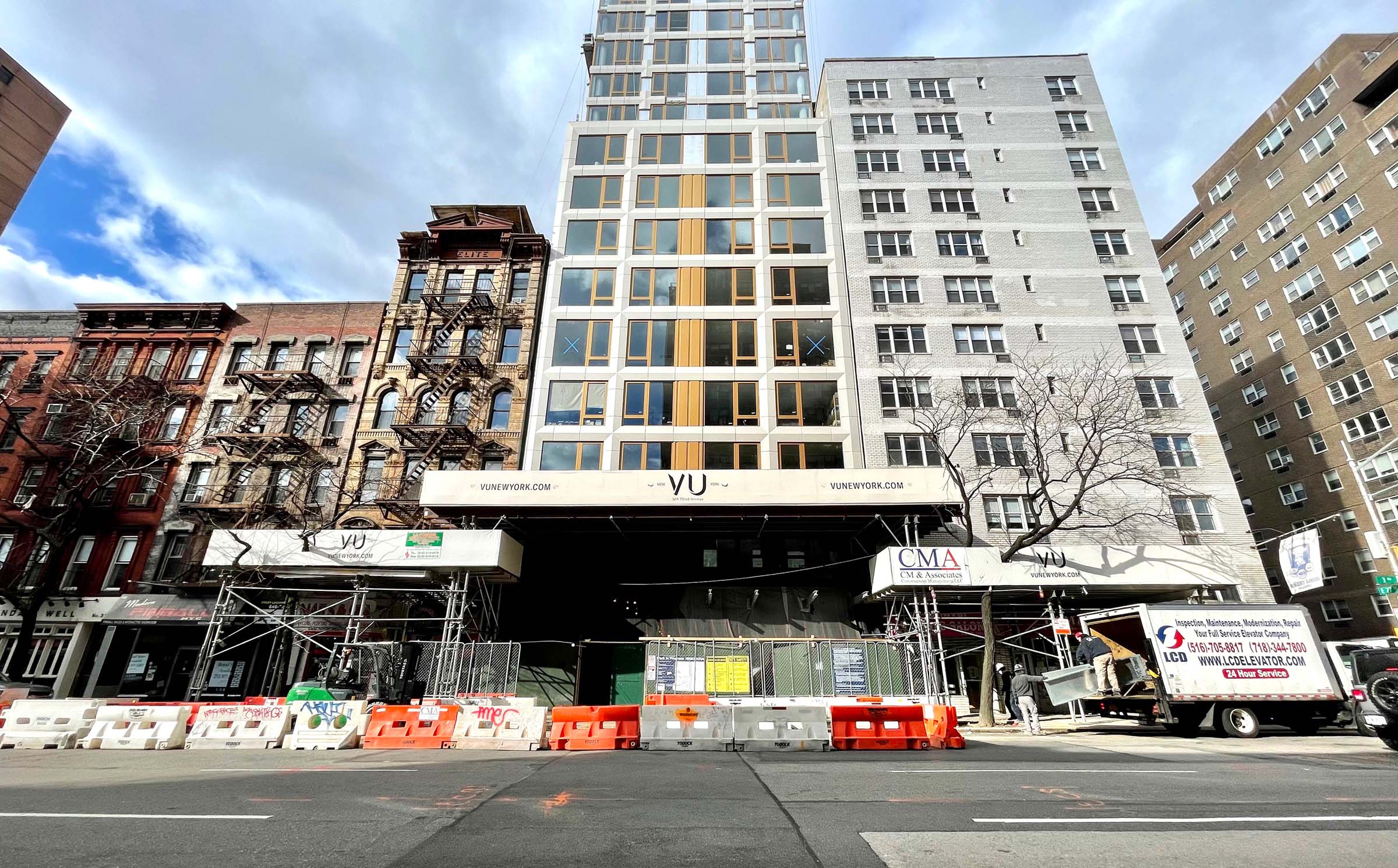
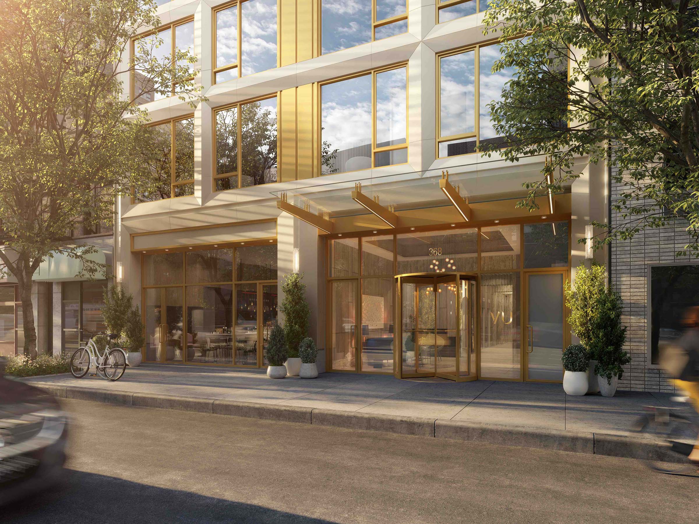
New York may be the city that never sleeps, but developers seem to be holding that expression to truth as the city continues to grow through a tough year. New developments can be seen in many boroughs, from Manhattan to Brooklyn, especially as taller residential buildings and swaths of reimagined neighborhoods, like Hudson Yards or Hunters South Point, become the norm. New York’s own Minrav Development tapped SLCE Architects to design the exterior of the latest residential tall to grace Kips Bay on the east side of Manhattan: the VU. A 36-story tower on a base, the VU offers unprecedented views within its mid-rise context for 100 units, expressed vertically with clean lines, bronze embellishments, and sculpted chevron details.
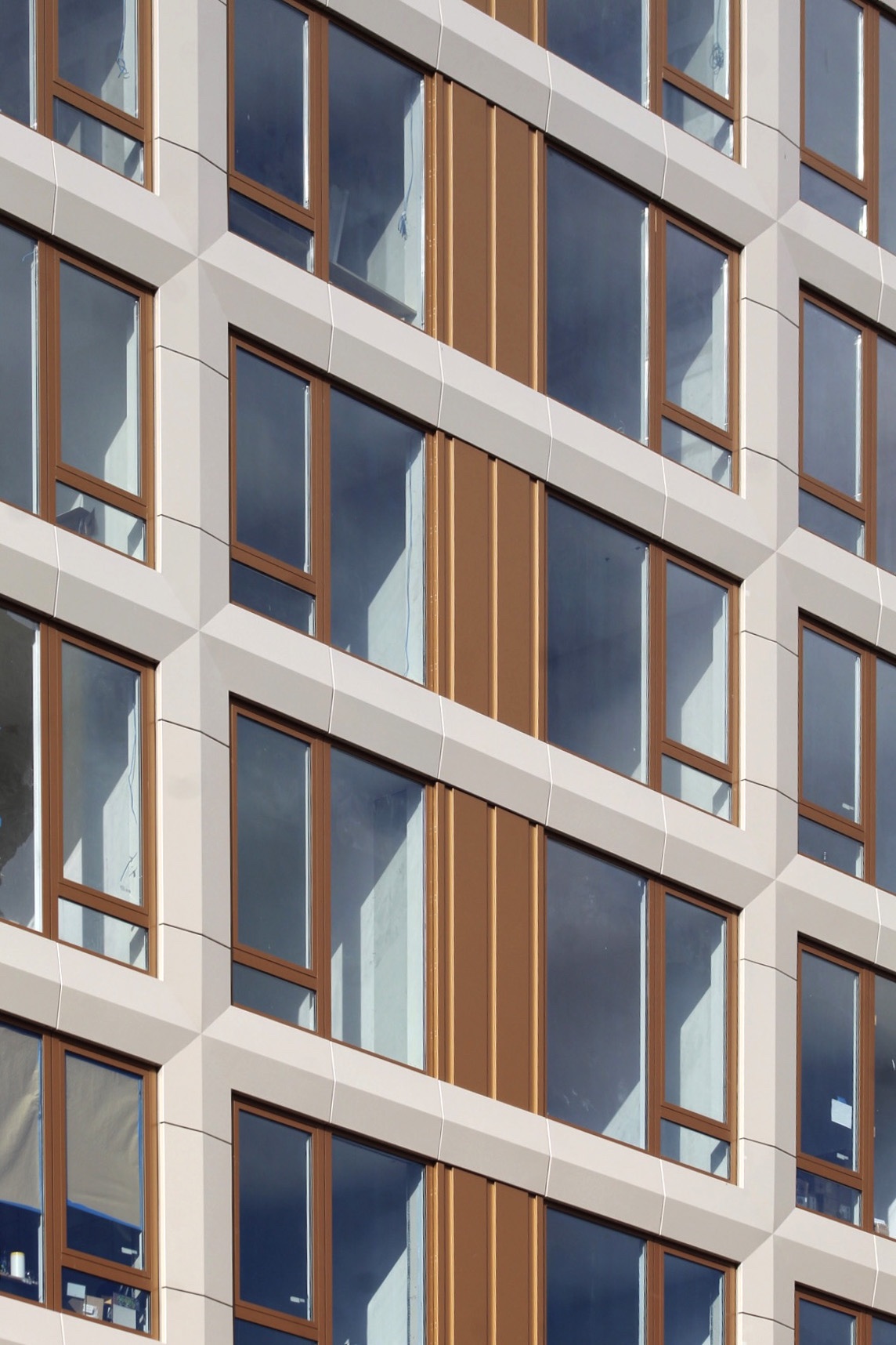
Yehuda Mor, managing director of Minrav Development, added that “SLCE’s design is stunning and makes a strong architectural statement within the context of the neighborhood, which is surrounded by lowrise, nondescript residential and office buildings that have flat and muted colors. VU soars over these buildings because it is 36 stories and it sits at the crossroads of 4 vibrant Manhattan neighborhoods—NoMad, Flatiron, Gramercy, and Kips Bay—so SLCE wanted a design that drew attention in a respectful way. The facade is a major part of conveying this idea. It incorporates three distinct elements: oyster-white aluminum panels, bronze-gold embellishments, and large glass windows. Combined, these materials create a beautiful effect that changes throughout the course of the day as the sun travels across it. During times when the sun is shining directly on the facade, the white of the facade and embellishments reflect the rays to create a gleaming effect that looks warm and inviting.”
The facade consists of bronze aluminum mullions vertically ribboned amongst the window wall system to emphasize the verticality of the structure. The oyster-colored architectural piers and spandrel covers add depth to the expansive glazing that stands out in the facade, especially compared to the common punched windows of its shorter neighbors.
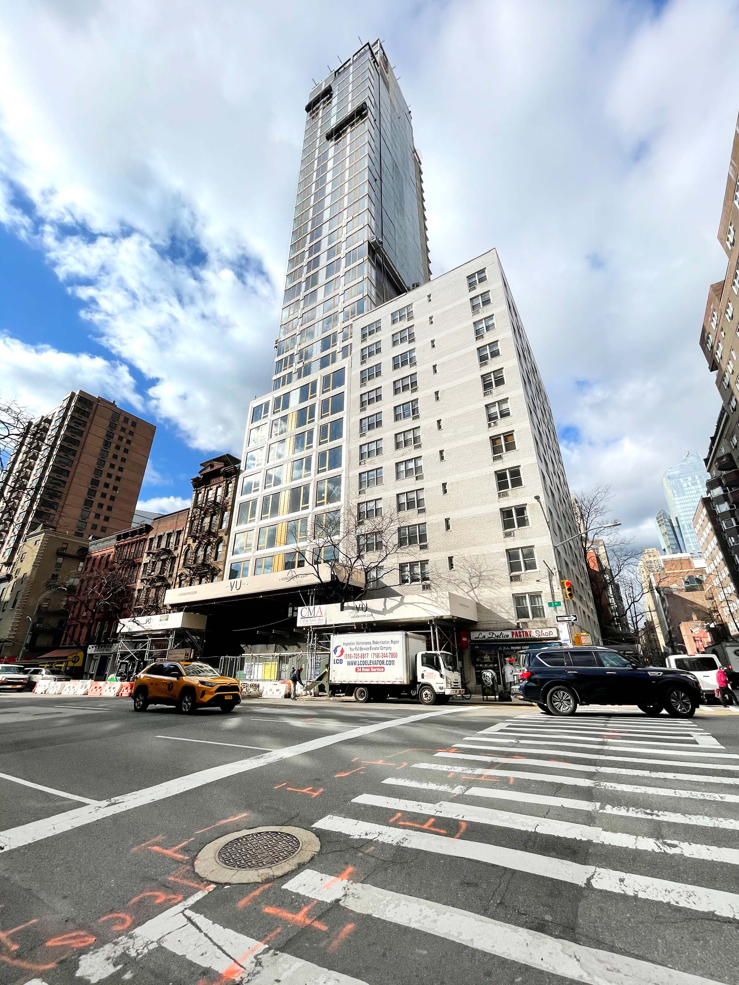
Splayed column and slab-covers anchored to the mullions as a rain screen system enabled the general contractor to close the water-tight envelope quickly before moving on to the decorative elements. The sky exposure plane, as mandated by the city’s regulatory zoning restrictions, called for the building to be set back at the 10th floor – hardly an issue to break a sweat when compared to the challenge of realizing a high-rise project on such a narrow infill site. Existing buildings forced assembly to be prioritized from the inside and, most interestingly, a large portion of the facade has to be installed from scaffolding hung off the superstructure after it had surpassed the height of the surrounding sites.
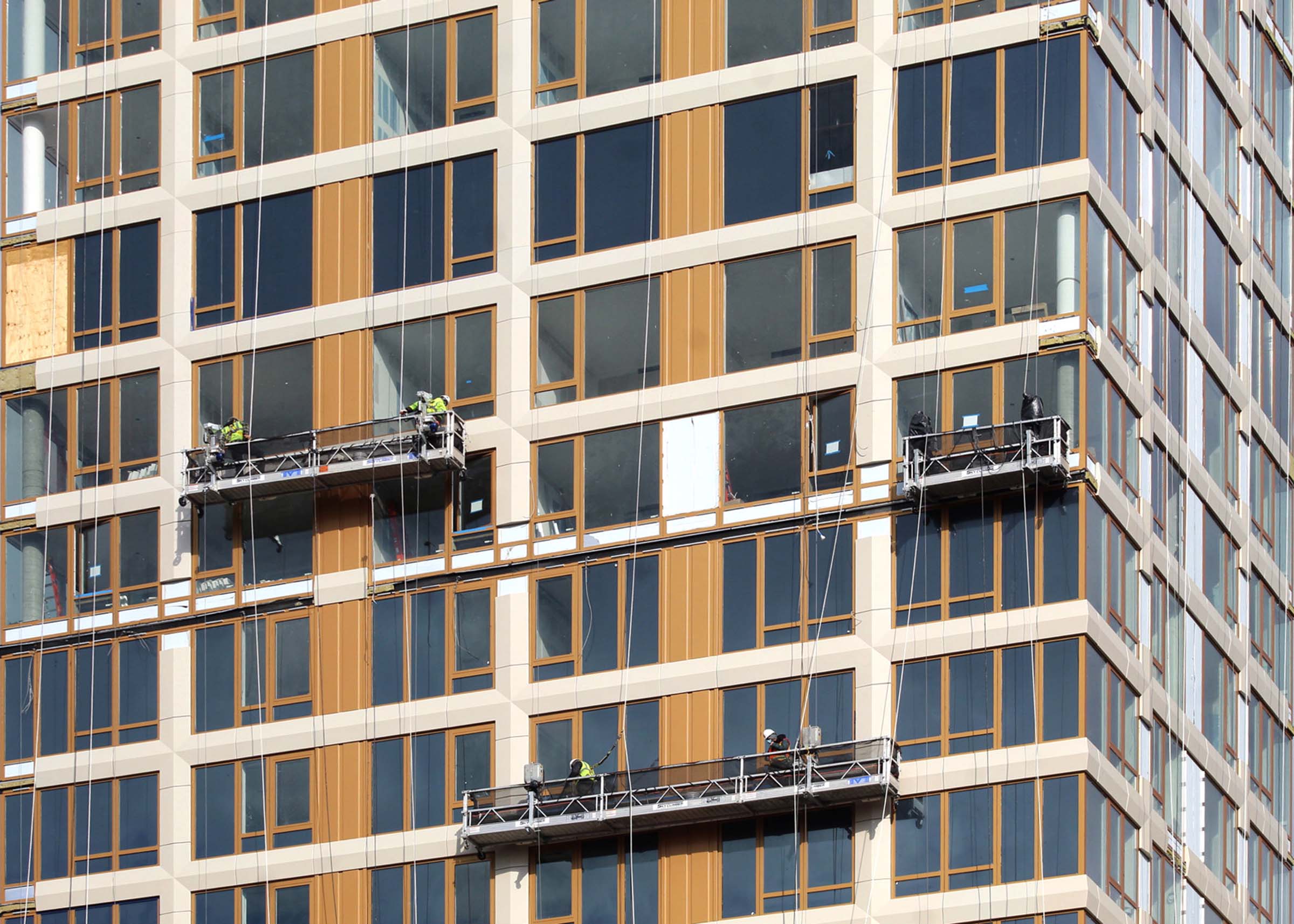
“VU’s facade system was designed, fabricated, and sourced from multiple countries,” added Mor, “with top-quality German system design, to the assembly in India and China. It took a good amount of work to coordinate supervision, inspection, and quality control with these companies globally. Nonetheless, we were able to create a facade that adhered to the highest quality of US standards, used the finest materials, and was manufactured under strict quality controls. The quality of the final wall product, Wicona, is stunning. It provides a captivating look-and-feel that, over time, will age beautifully.”
